Contemporary Textile Art

Art on the Wall

This week I've been focused on getting 'art on the wall'!

The first task was to deliver artworks to Jing Jo's Cafe in Kangaroo Valley for the new show 'Still Life' which was hung this week.  If you happen to be in the vicinity I would highly recommend dropping in for a coffee and checking out the art!!

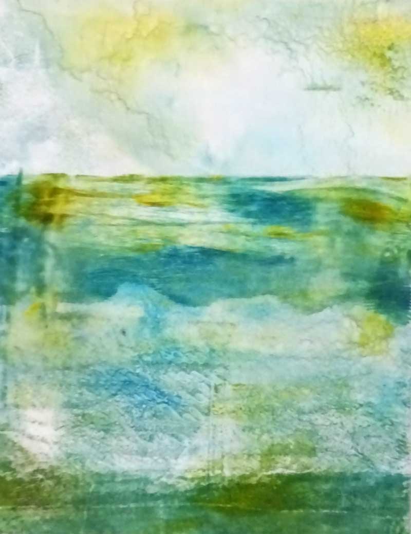
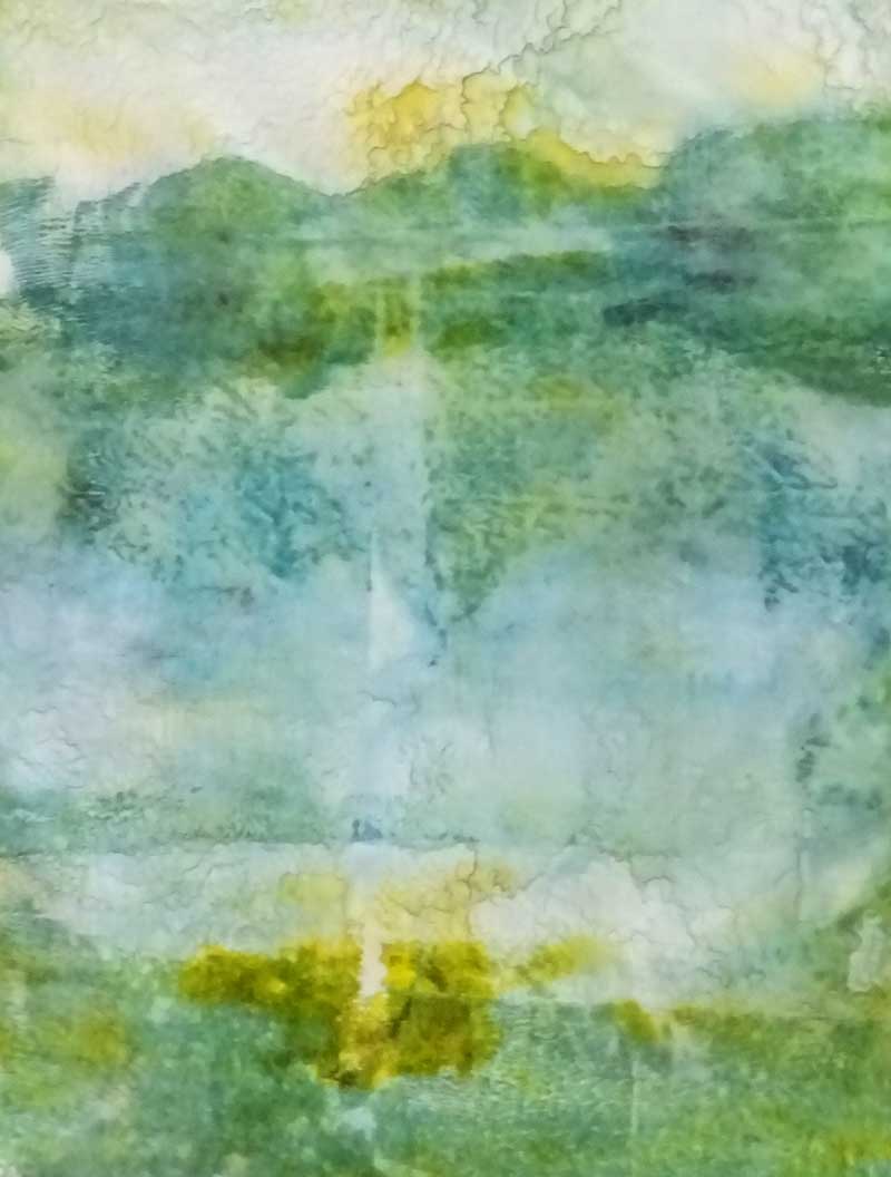
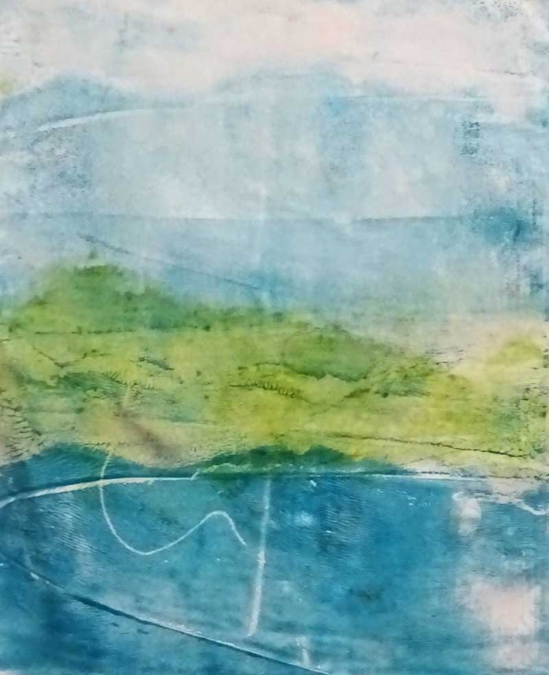
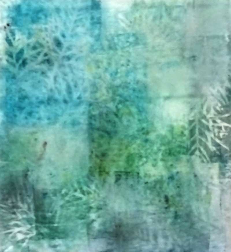
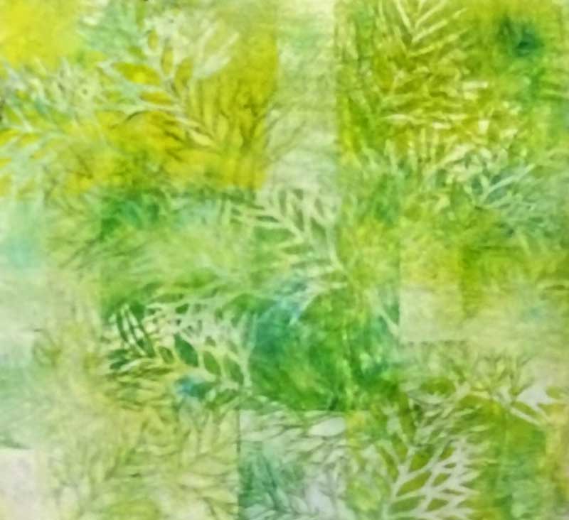
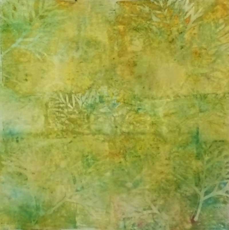
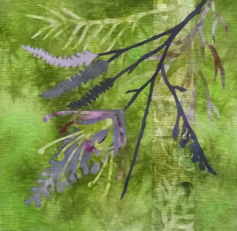
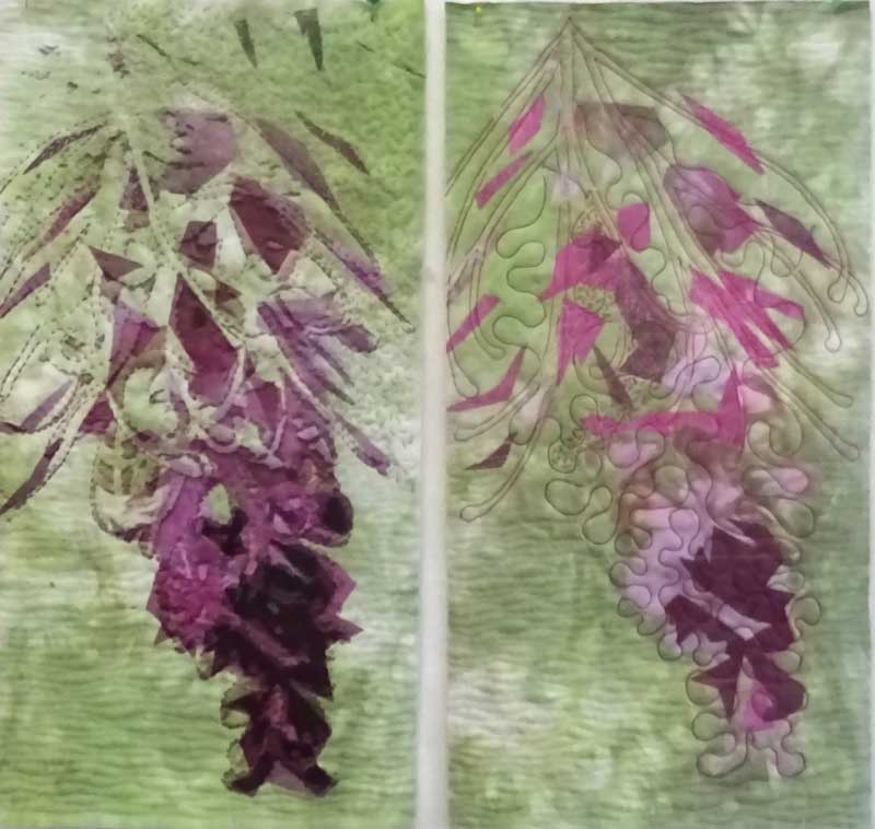
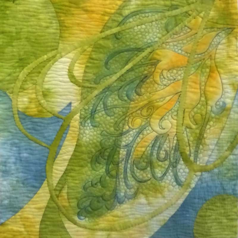
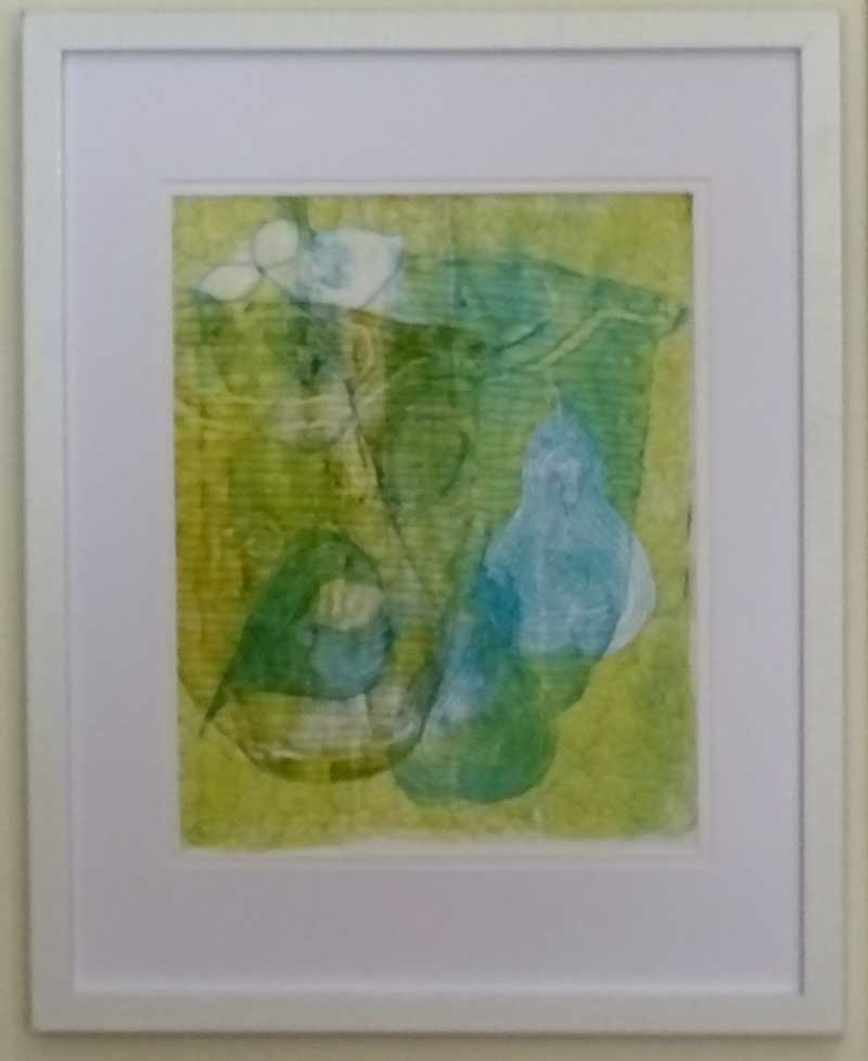
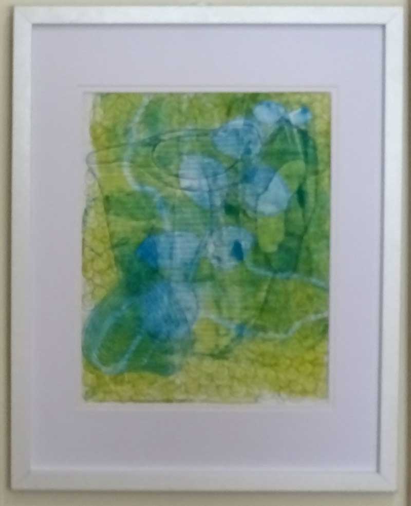
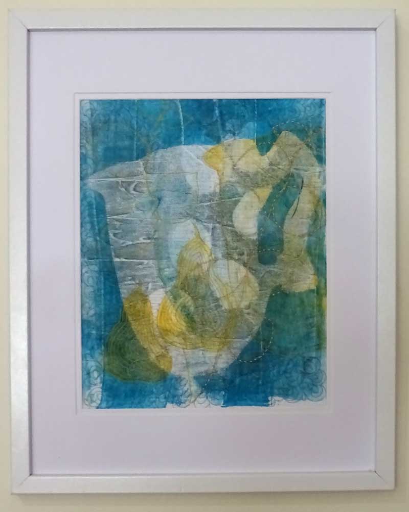
I sent across three of my framed and stitched 8" x 10" monoprints .....

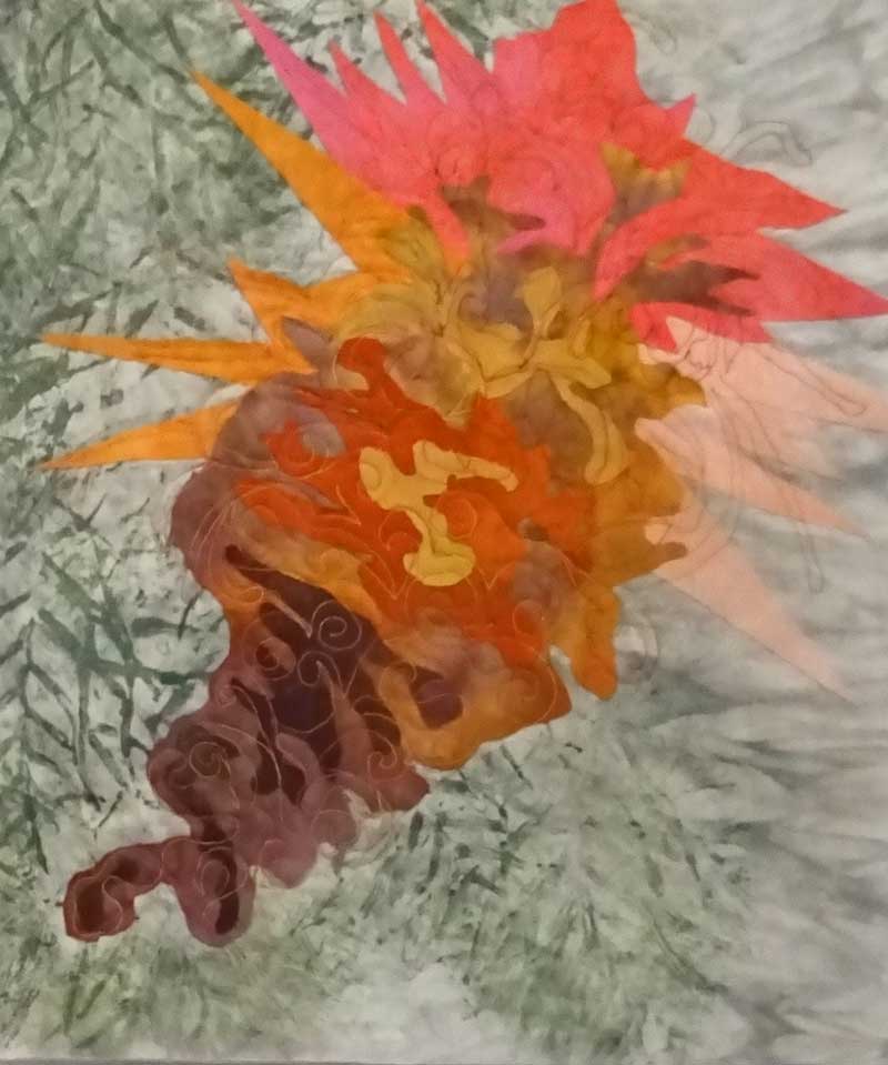
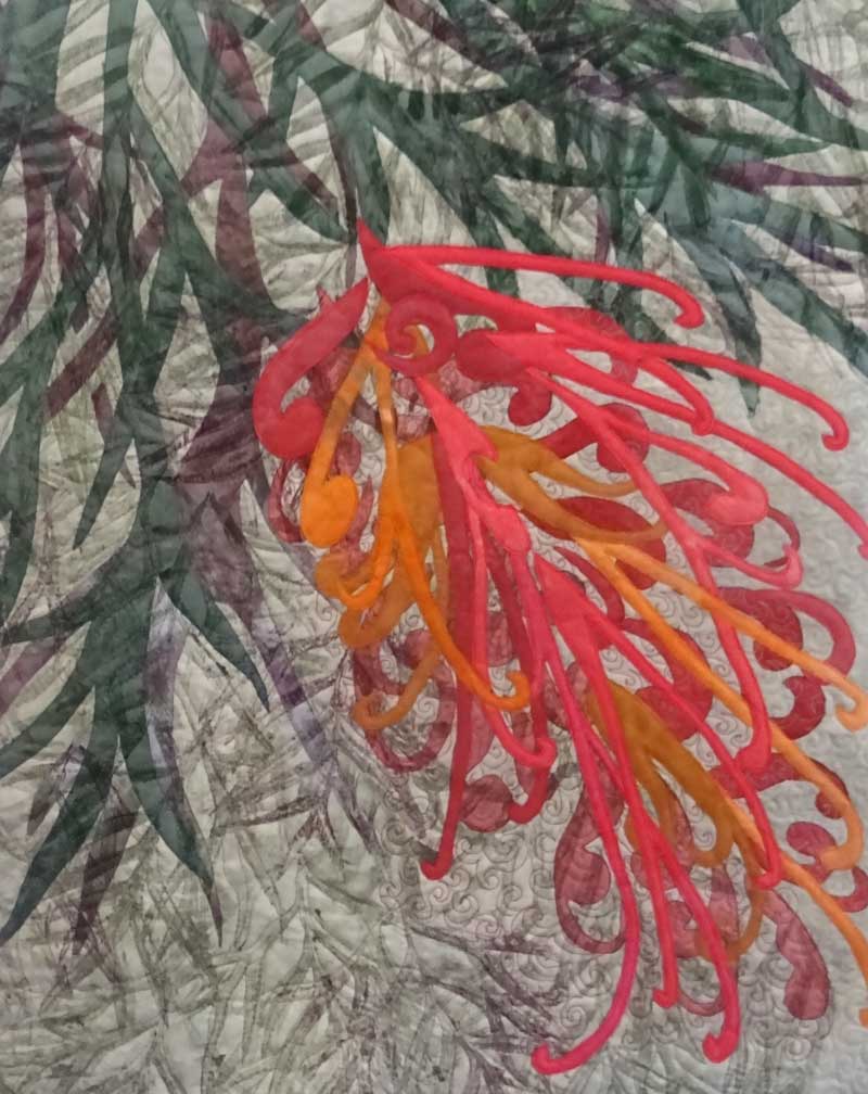
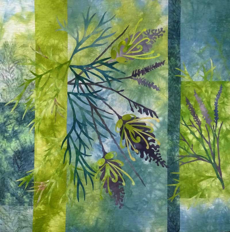
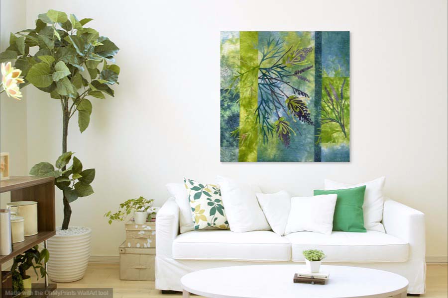
as well as a larger, pieced and stitched monoprint  16" x 20"  mounted on a stretched canvas ....

StitchedLifeinBlue1.jpg

Stitched Life in Blue 1

It's always a challenge for me to photograph groups of artwork on the wall  ... we have an old house with lots of timber panels and strips of timber dividing the wall space.  

So while I was browsing the internet for some ideas, I came across a free app called WallApp which lets you upload a photo of your artwork so you can see what it looks like in a room/living space - there are half a dozen room options and you can also upload a photo of your own room.

Here are a few examples ......

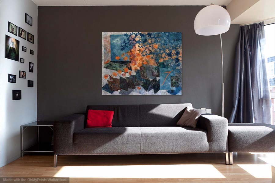
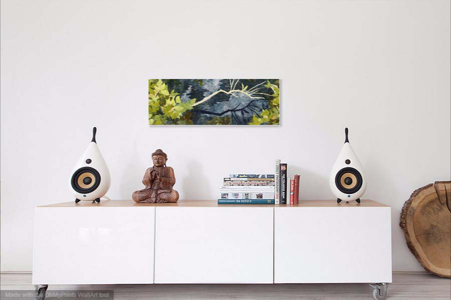
It's very easy to use and quite fun!!! 

This led me to thinking about the reasons for choosing a piece of original art/textile art for your home.  The following are my thoughts about the possible reasons .....

The textile art creates a mood or feeling that can evoke memories or take you to another place.  It adds personal character,  can provides a color palette for the room and makes a room feel finished.  It's something to look at and contemplate,  especially  if it is a work that speaks to you .....  and can inspire and foster creativity.

Textile art particularly,  adds warmth and a softness,  it creates a connection with the makers hand that has created the work and to a long tradition working with fabric and stitch.  

What draws you to a particular piece of art/textile art ... something you own or would like to??  Please comment on why you have chosen to buy a  particular piece of art....

Thanks for reading .... CC

An Afternoon with my Gelliplate .......

This week I spent an afternoon printing with my gelliplate!   I tried some experiments and worked  on printing some fat quarters of fabric for the next grevillea design ....

The experiments were inspired by a short online class with Carla Sonheim,  that I purchased recently. 

Carla's technique produces some lovely abstract monoprints with a landscape feel so I was keen to try it out.  Here are some of the results ......

I think  these have a lot of possibilities as backgrounds for a new idea I have .......

The fat quarters for the new grevillea design are printed using grevillea leaves and a couple of abstract stamps.  I wanted a subtle, blended print without too much contrast,  to use in the background.  Printing fat quarters means repeated placement of the gelliplate and sometimes this results in a build up of paint in some areas.  I tried lightly washing off the excess which worked very well and helped with the blended effect I was looking for .......

A good afternoons work I think!

Thanks for reading ......CC

New WindingWay Landscape

This new piece has been reworked a few times .... I was pretty happy with the landscape background but struggled to find a fabric for the overlay.  In addition,  this piece at 16" x 16"  is larger than the previous works in this series so that added an extra challenge for the composition!!

                                 'Winding Way in Pink'  © CarolynCollinsArt 2017  16" x 16"

                                 'Winding Way in Pink'  © CarolynCollinsArt 2017  16" x 16"

The larger size of this piece called for a rethink which resulted in the addition of some new elements ... a more complex landscape background and in this piece a digital image printed on organza which adds  a nice sense of depth.  

I thought it would be interesting to look at the development of this series to date ... starting with the first compositions at the bottom left   ......

The next step is to develop and refine  this larger design .......

Thanks for reading ...........  CC

Grevillea's in Review

My Grevillea Series has been rolling along for a while now and before I launch into Number 10, I thought it would be a good idea to review  progress.  Looking back and seeing the work all together is helpful with new directions and new ideas ... not to mention that it makes me get my photo files into order and update my art database!!

So here they are in sequence of construction .....

The first piece turned out to be a disaster from a technical point of view!  The issue related to layering fabric over the printed organza making for a very unstable piece when it came to the stitching!!!  However I like the color and design ideas and this piece remains on my design wall for inspiration.

After that experience,  I stuck to applique and reverse applique (with no fancy fabrics)  with a good result and second grevillea is part of the SAQA 2017 Trunk Show.  

In the Pink Grevillea piece I was determined to master the organza, because I really like the effect of printing on it,  and tried a variety of  flower shapes. This was a good learning experience but it lacks something from a design perspective!

In the middle row ...  the stylised fower design and development of the backgrounds by incorporating hand printed fabric has worked well and I am really pleased with these.  Peaches and Cream was part of an exhibition at Kangaroo Valley and now hangs in a new home!  

Recently I have been exploring a more abstracted flower design in the pink/purple pieces and have returned to the original idea of stitching the flower design ....... with much more success!

The final two pieces use the backgounds I made a couple of weeks ago,  now stitched and appliqued.  I think the blue/green/yellow piece is the most successful.

While I contemplate what next,  I would love to know which grevillea you like best??

Thanks for reading .....  CC