
Back at the start of 2022 I had this bright idea to map my personal colour palette by keeping a chart of the colours I was using in my studio over a 12 month period. Here is a link to that post ….
This idea came about after researching colour palettes and an artists reference to her personal colour palette …. which made me wonder what my personal colour palette might look like!
Now I know!
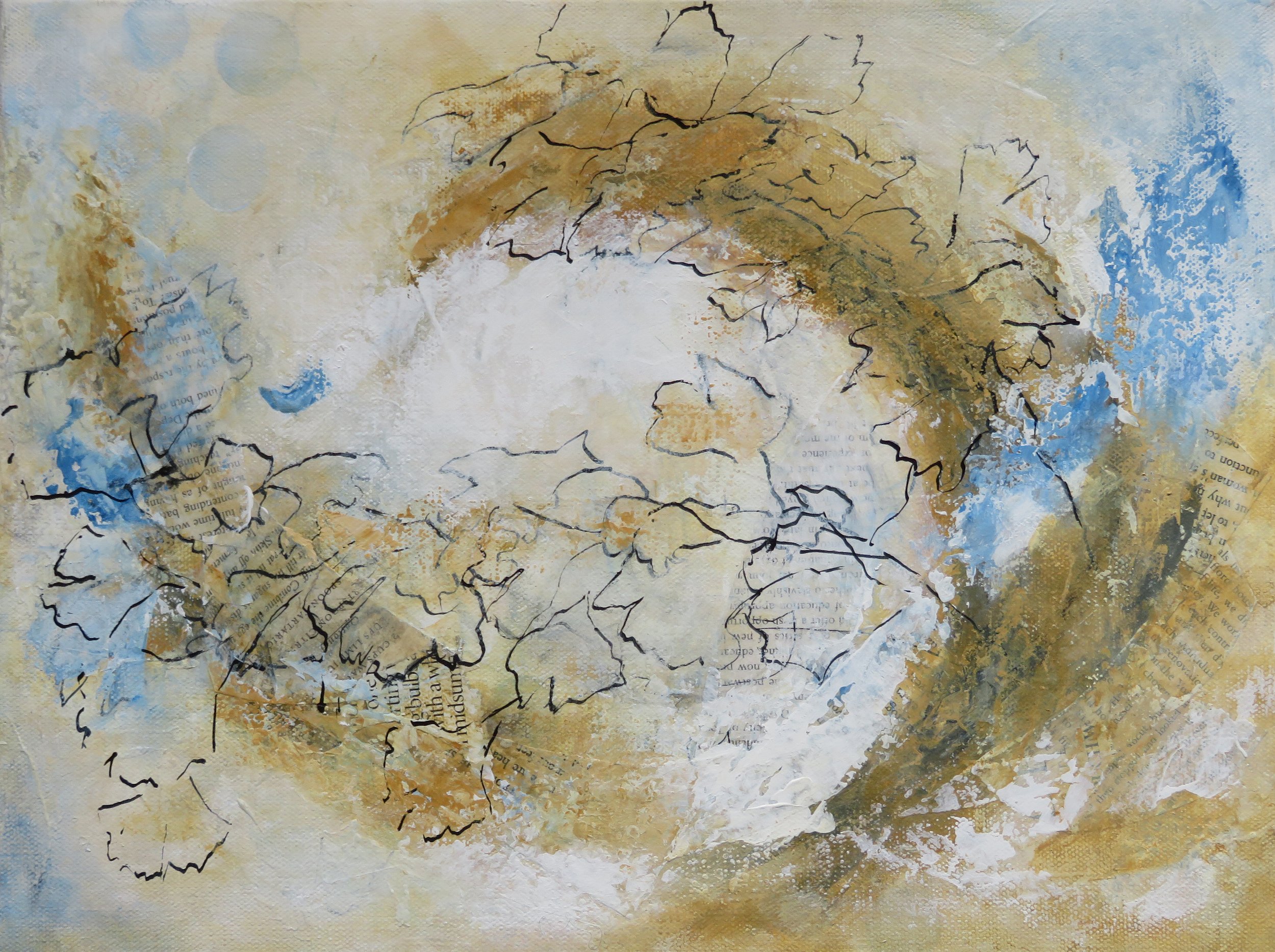
Here is my chart … it survived the chaos of the studio, although a little spilled ink on one corner mars it’s beauty!
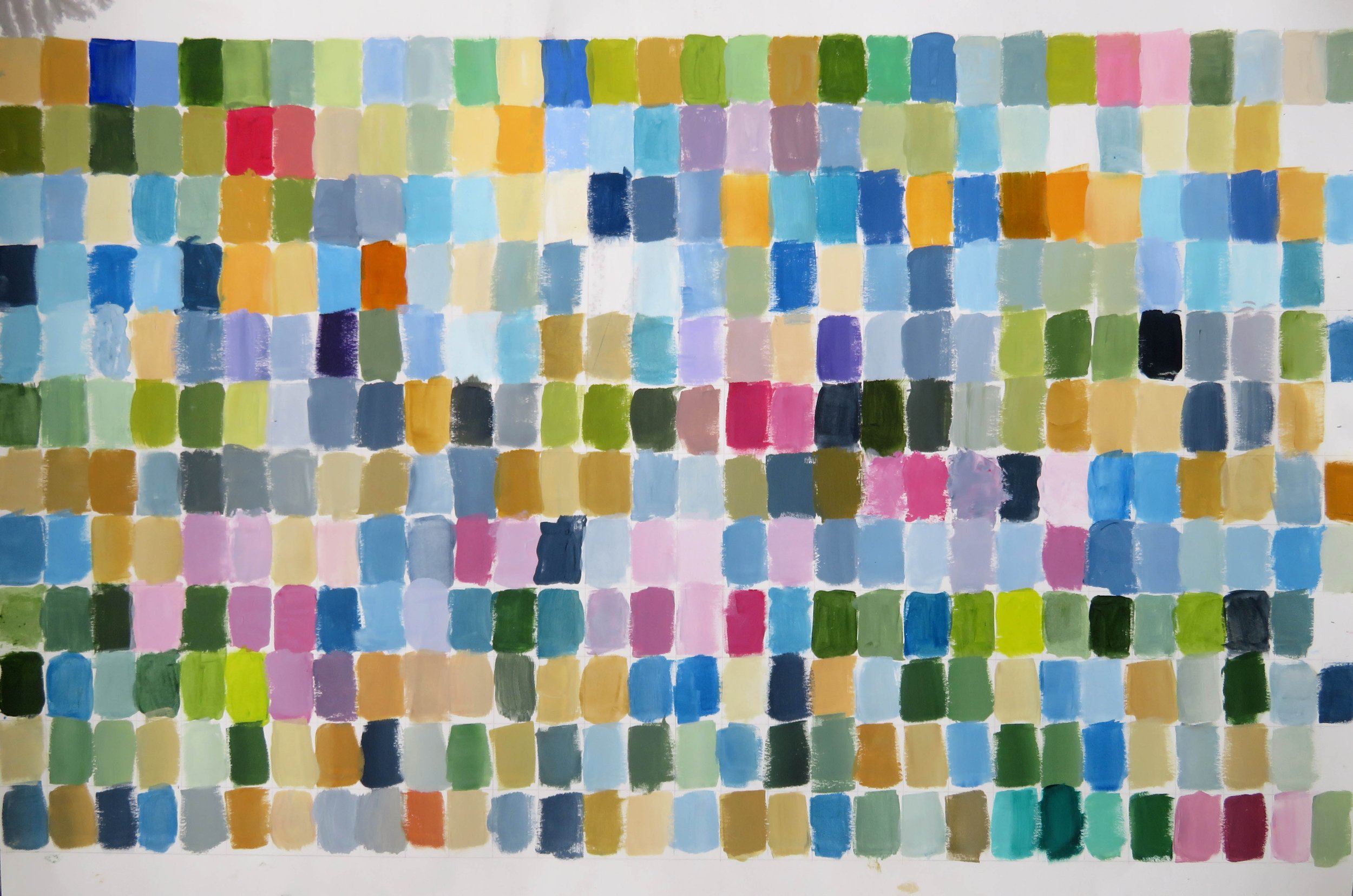
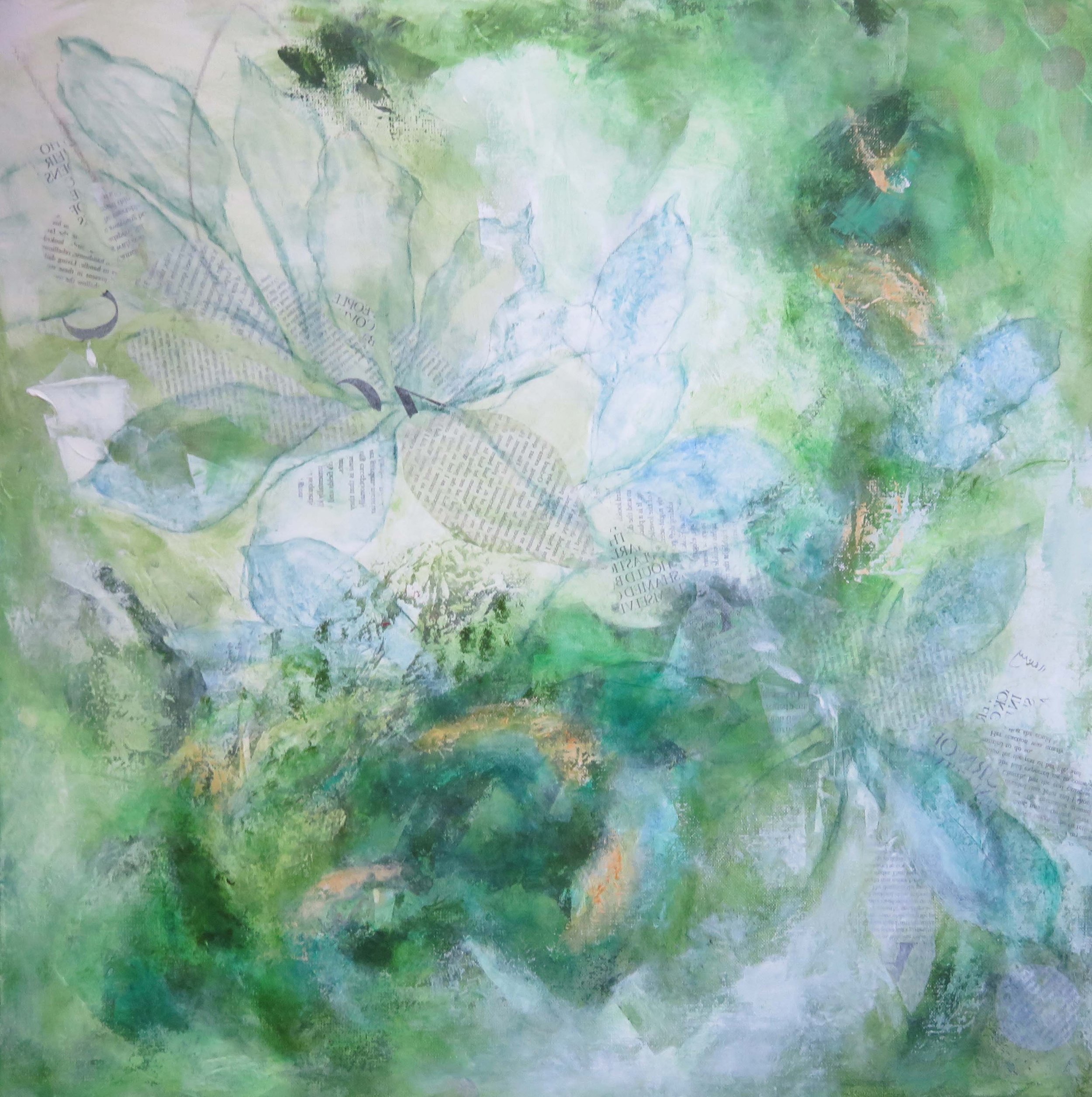
While it doesn’t resemble any of the art I made during the year, I can see that these are my colours ….
Muted colours
Blues and greens and lots of variations in between - I’m definitely a cool person, even to the point that my choice of red is on the blue side!
The ochres and siennas that run through the chart along with the Payne’s grey, are earthy colours and provides a grounding for the palette.
There are plenty of light neutrals and tints .
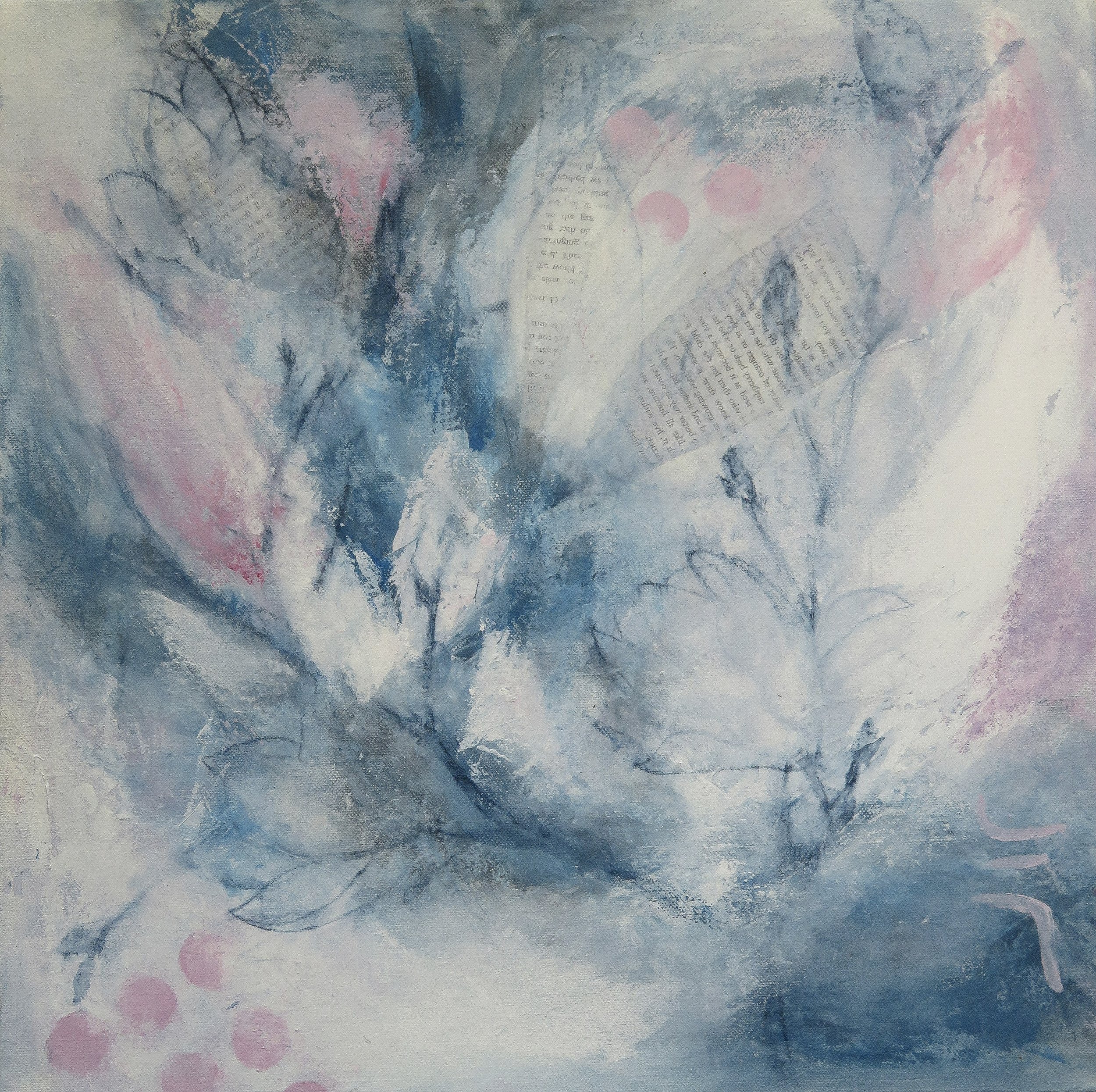
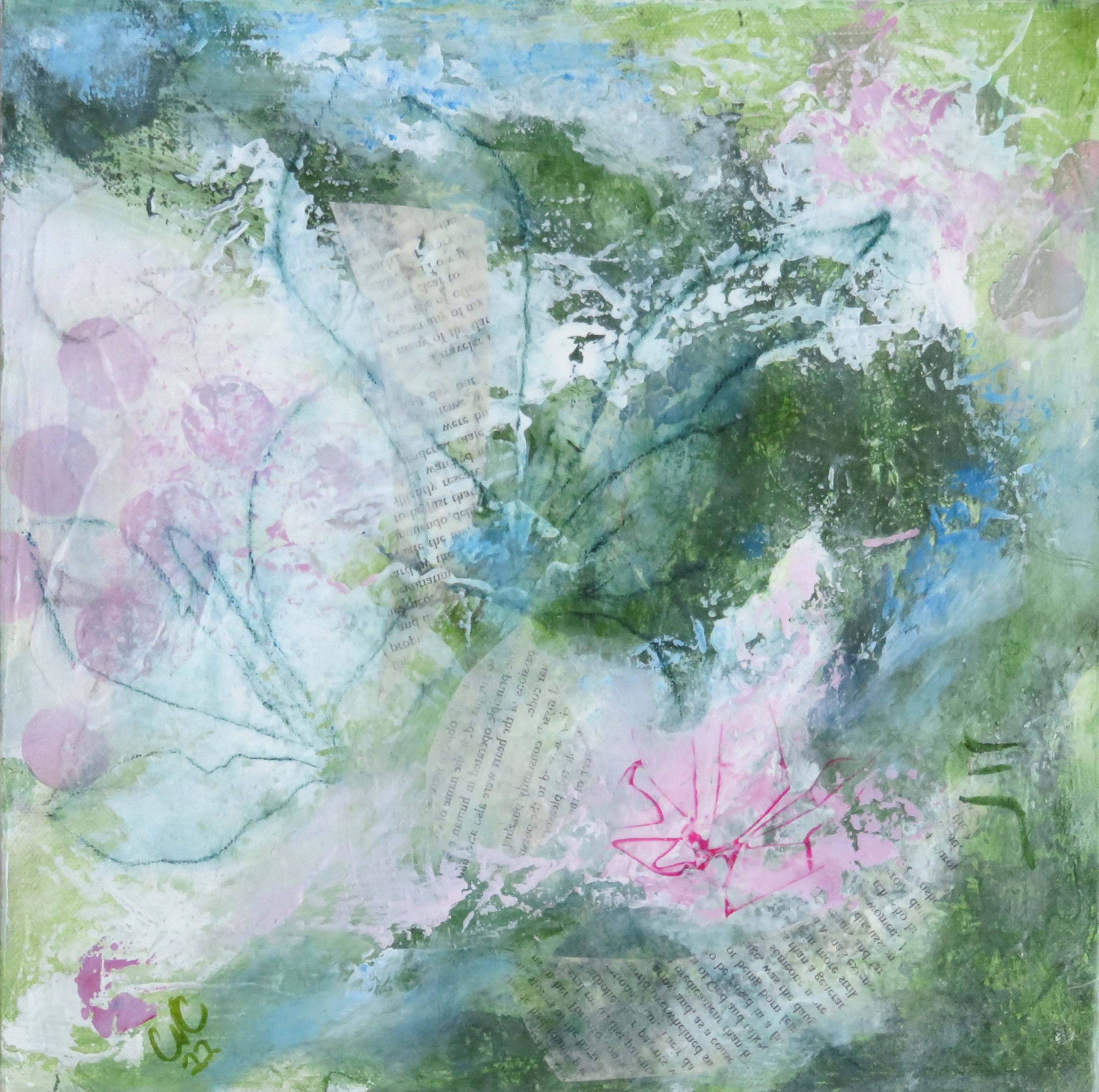
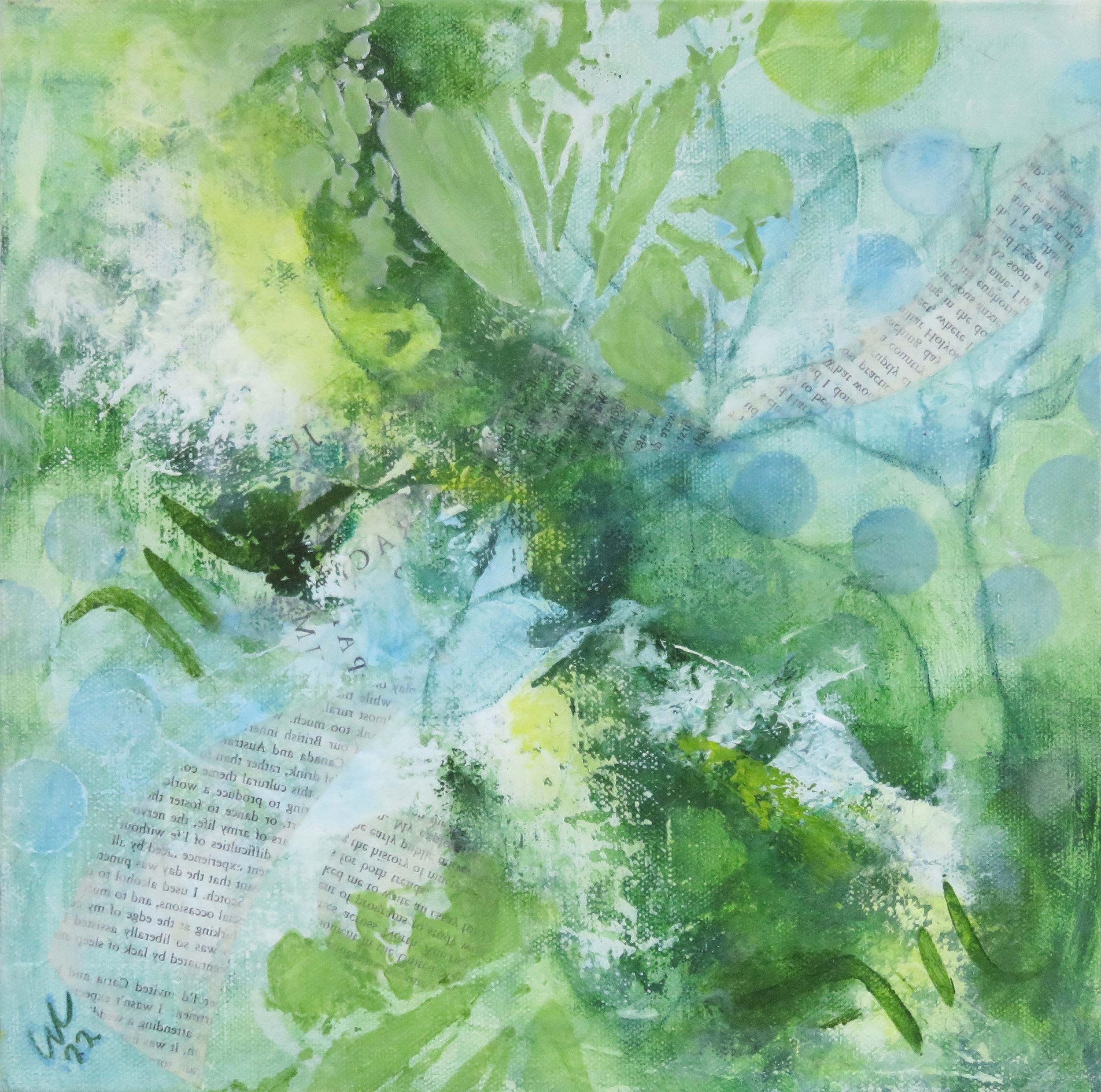
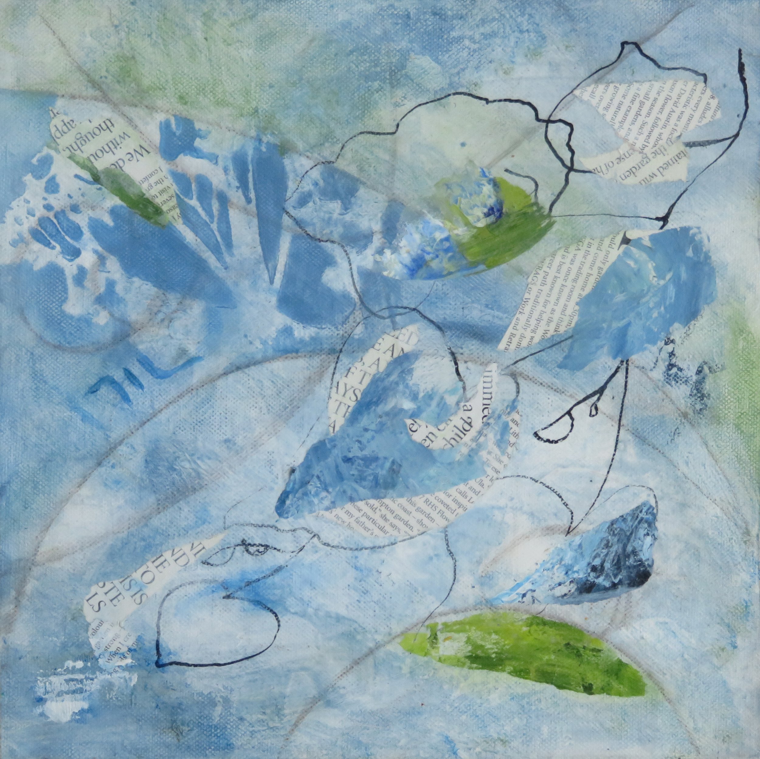
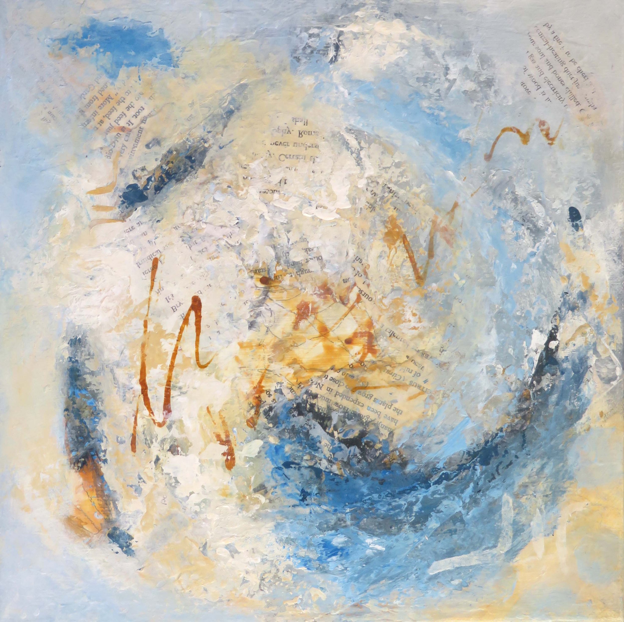
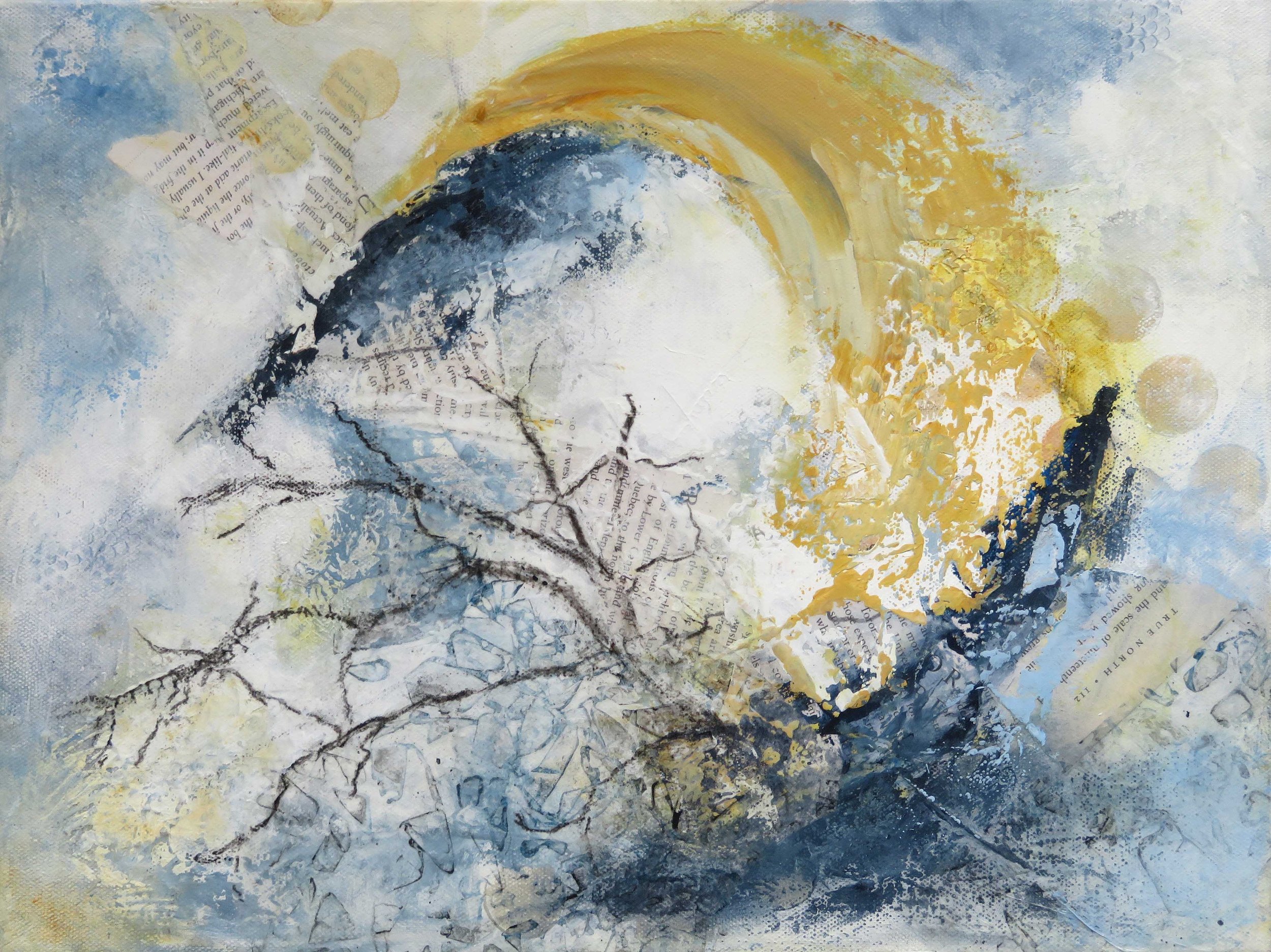
If you look at some the art I made last year you can see that I love to work with …
-limited palettes
-both cool and warm variations of a colour
-increasingly with some strong contrast
-generally lean towards the use of lights and white to make for some luminosity
What can I learn from this and how can I push the boundaries?
I am thinking about extending my use of the colours within this palette, for example exploring different combinations of colours, exploring more tones and tints, more use of complimentary opposites and considering both saturated and muted colour …
I’d also like to see how my palette changes over time - so the plan is to keep mapping through 2023!
Thank you for reading, I appreciate your time.
With very best wishes for 2023 …. CC
Always