Loving my Handmade Concertina Sketchbooks ....

About this time of year my focus returns to my sketchbooks and thoughts of the next evolution of my art .... and a new sketchbook!

Purchased sketchbooks have their limitations....

  • size/format of pages

  • weight of paper especially for wet media - availability and price

  • painting only one spread at a time

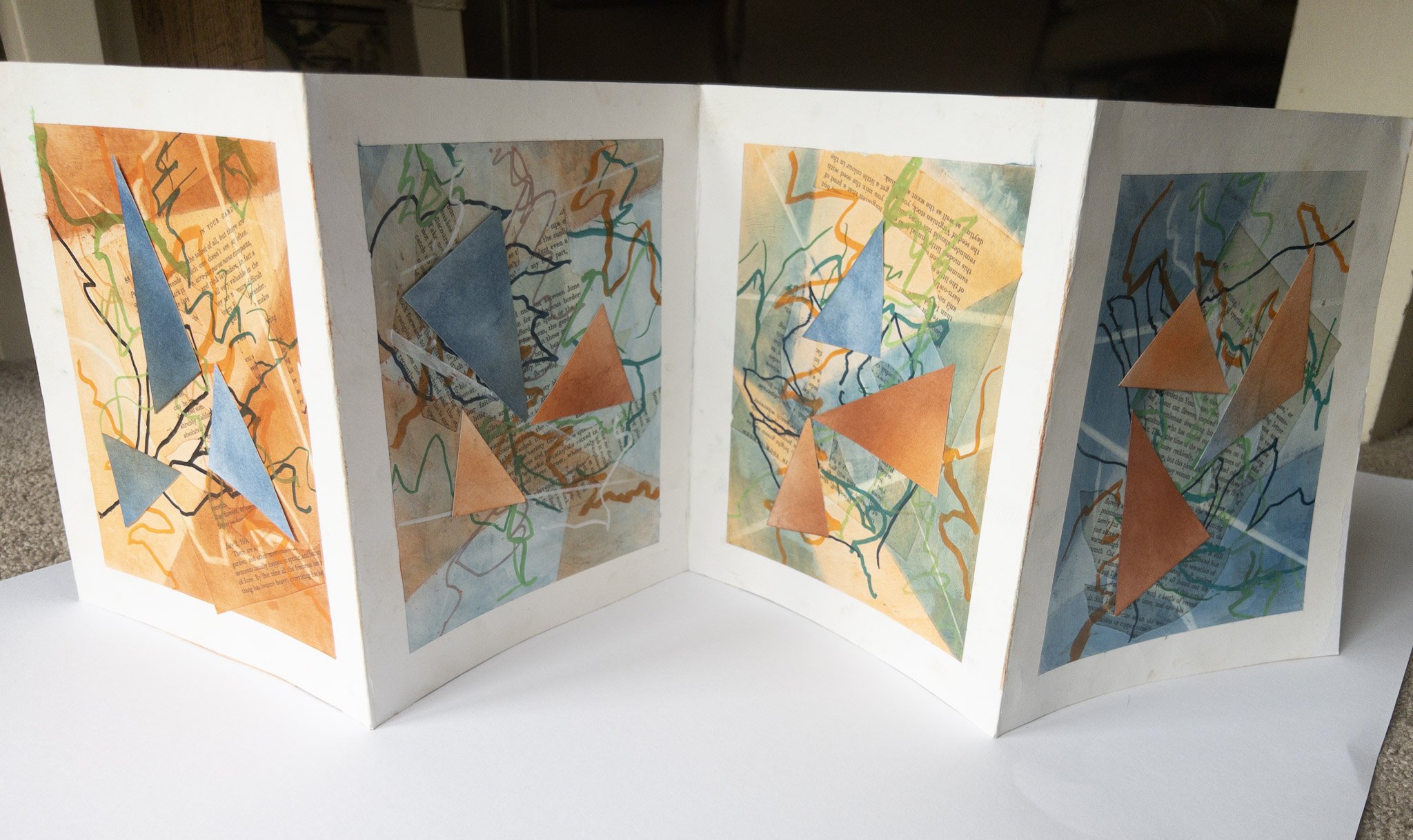
So this year I've decided to make my own concertina sketchbooks. Found some 300gsm paper (on sale!) and have cut it into 19cm (7.5 ins) strips and I can join as many of these as I like! This gives me a 19 x 37cm (7.5 x14ins) spread and so many options.

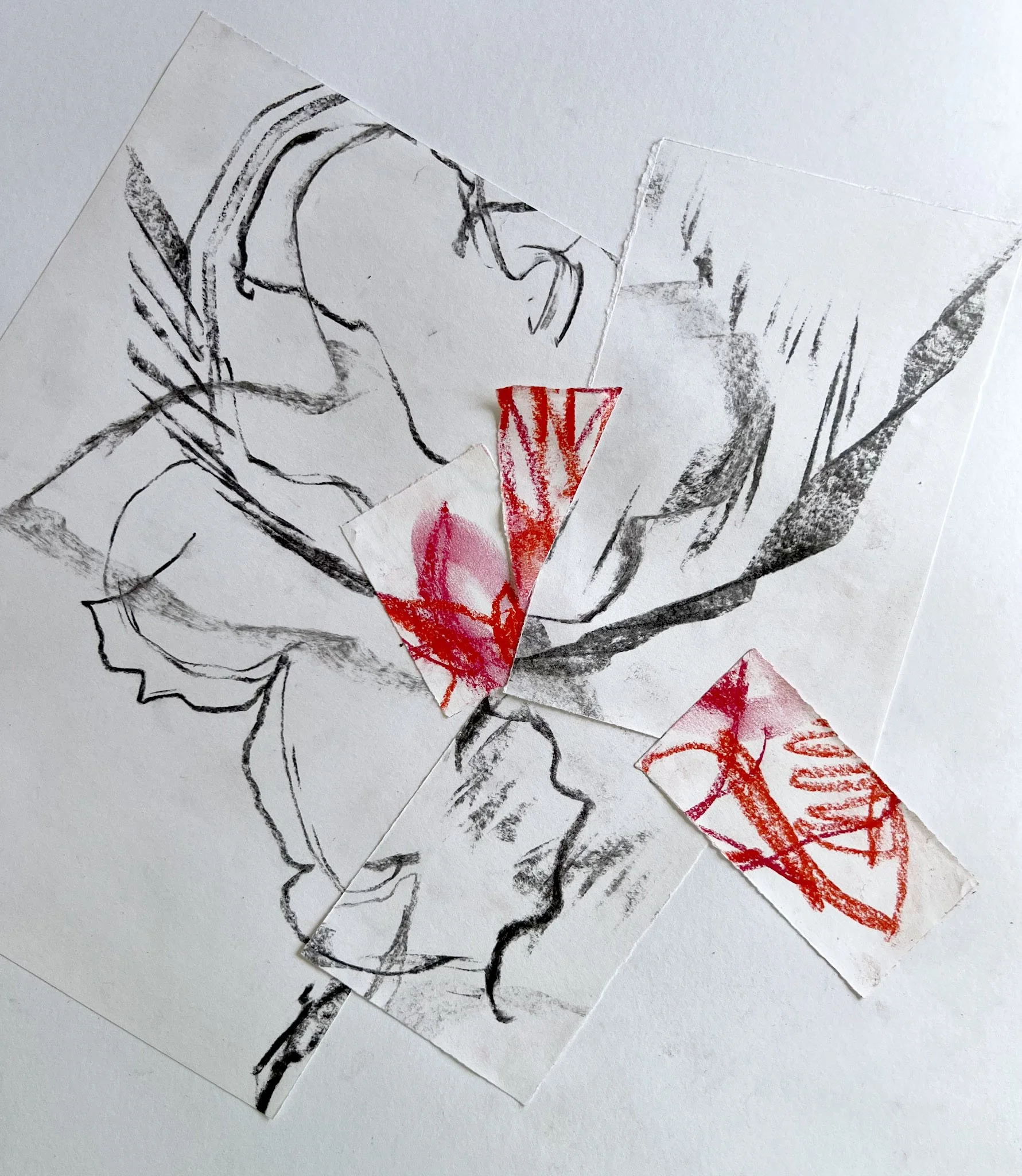
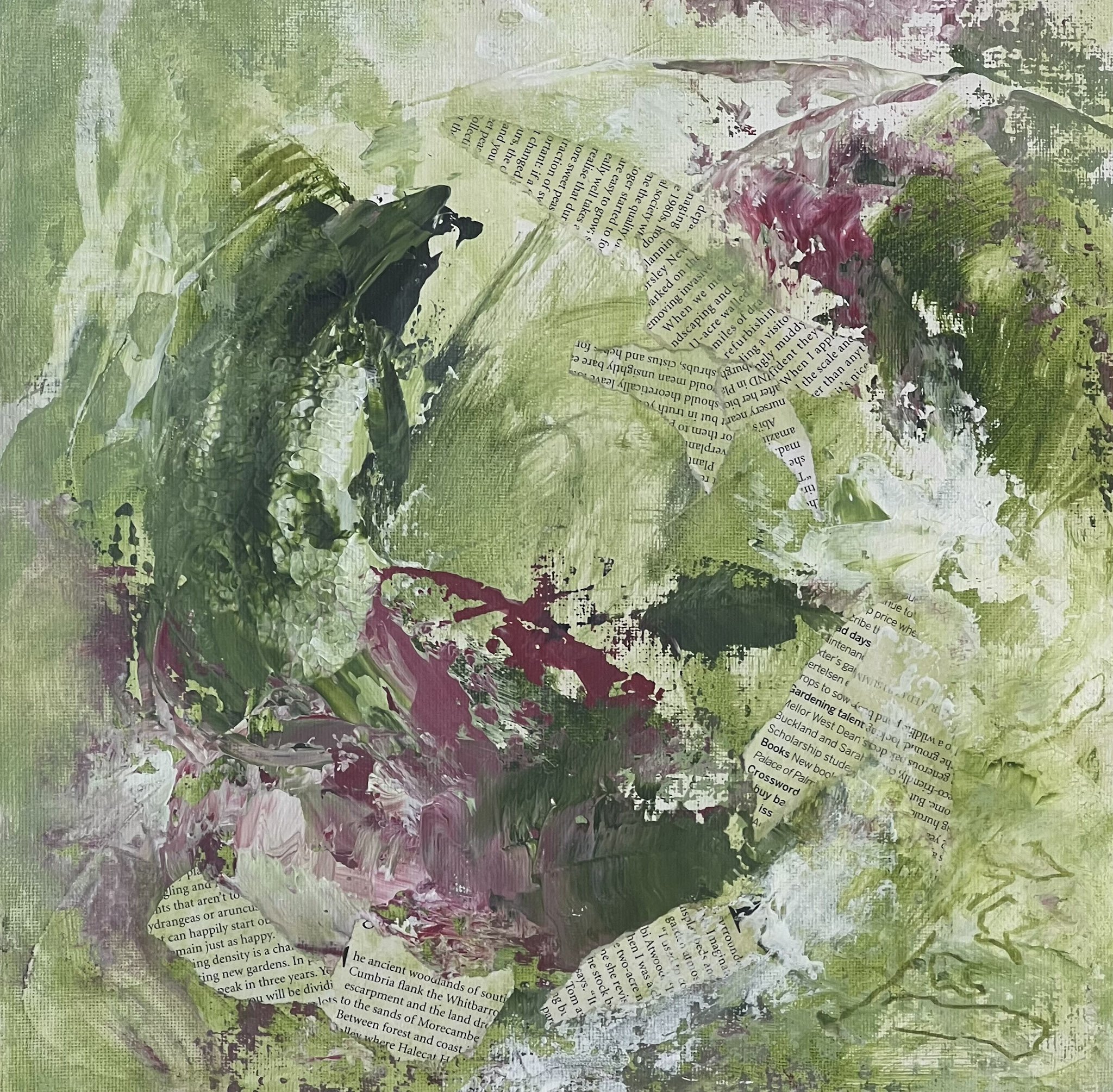
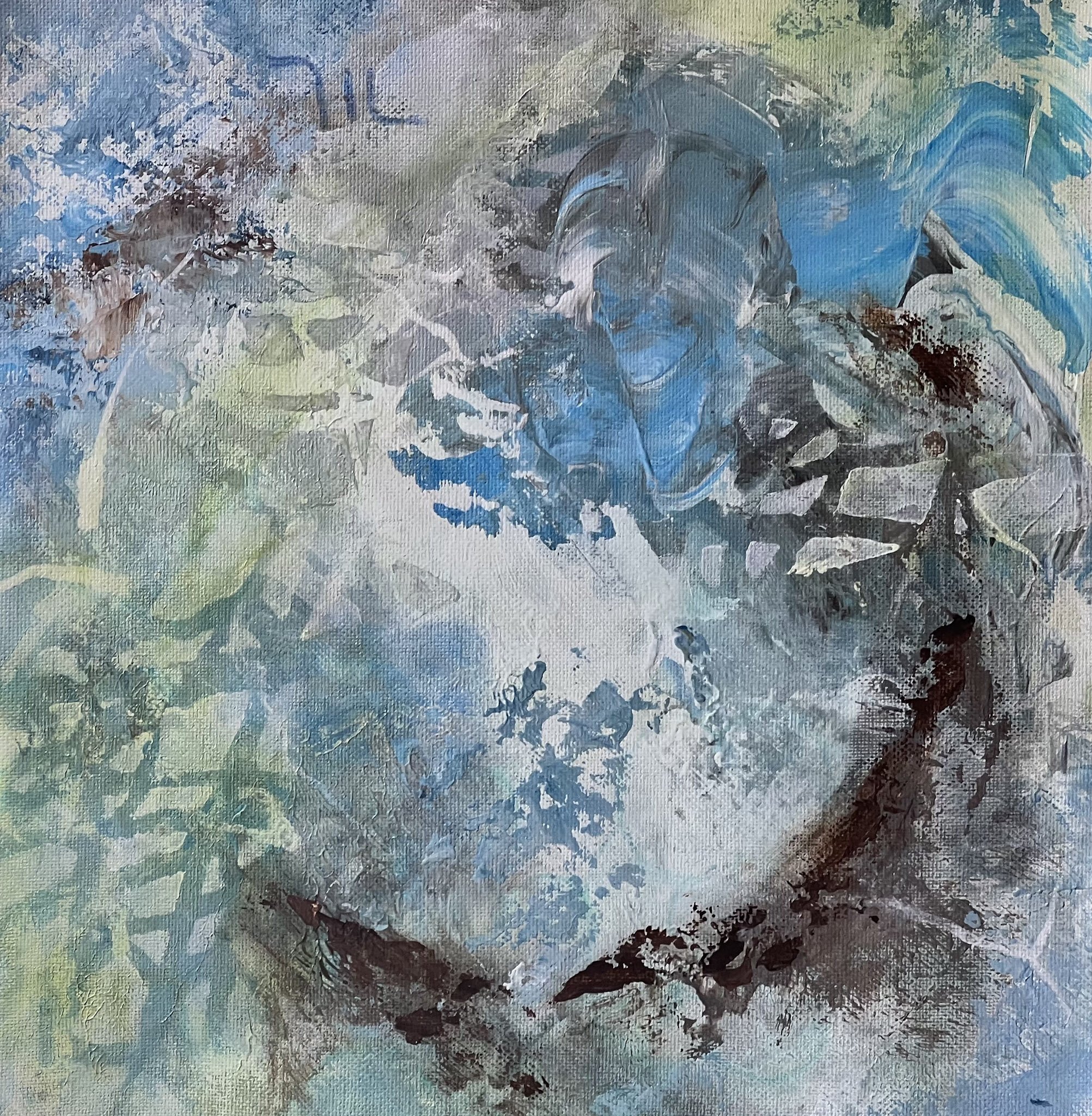
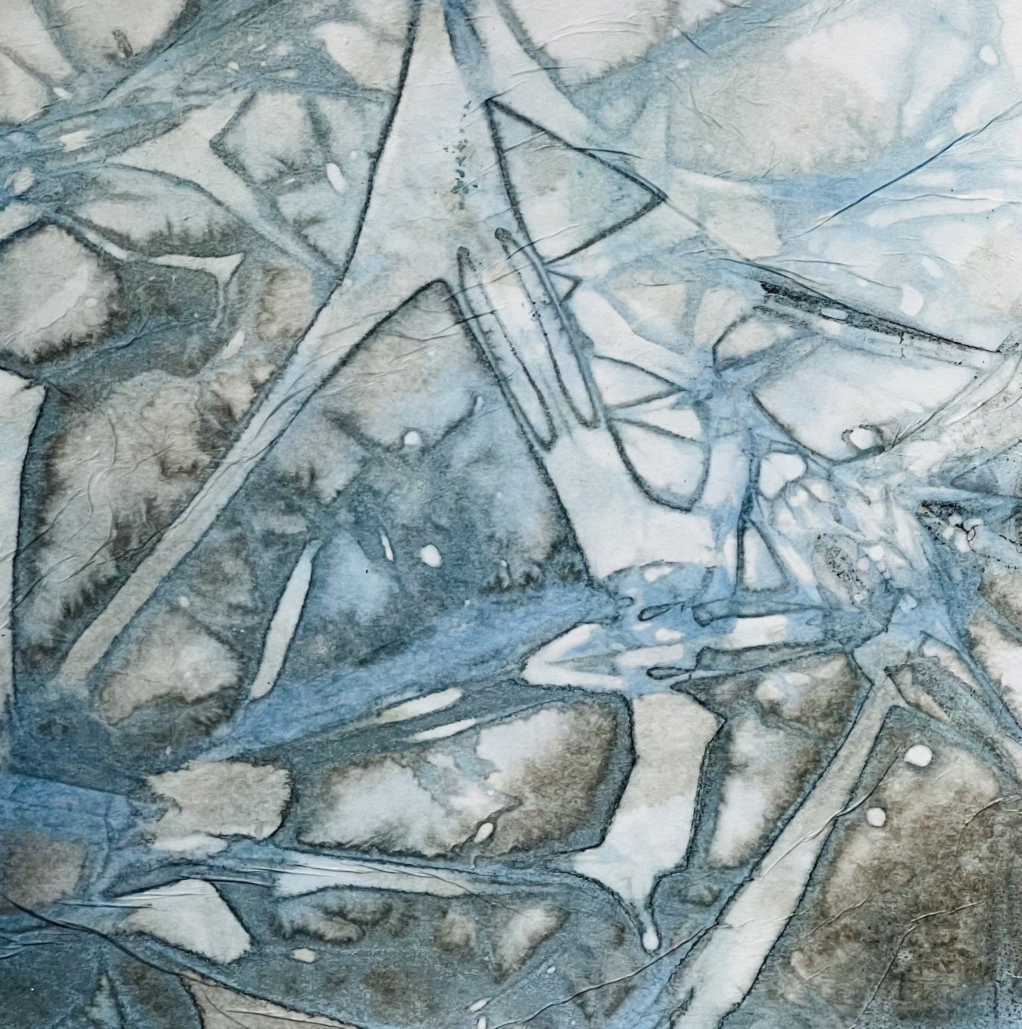
My first was a smaller version, exploring ​one of the techniques we learned in drawing class, as we made our fabulous collaborative work for the show at the Shoalhaven Regional Gallery.

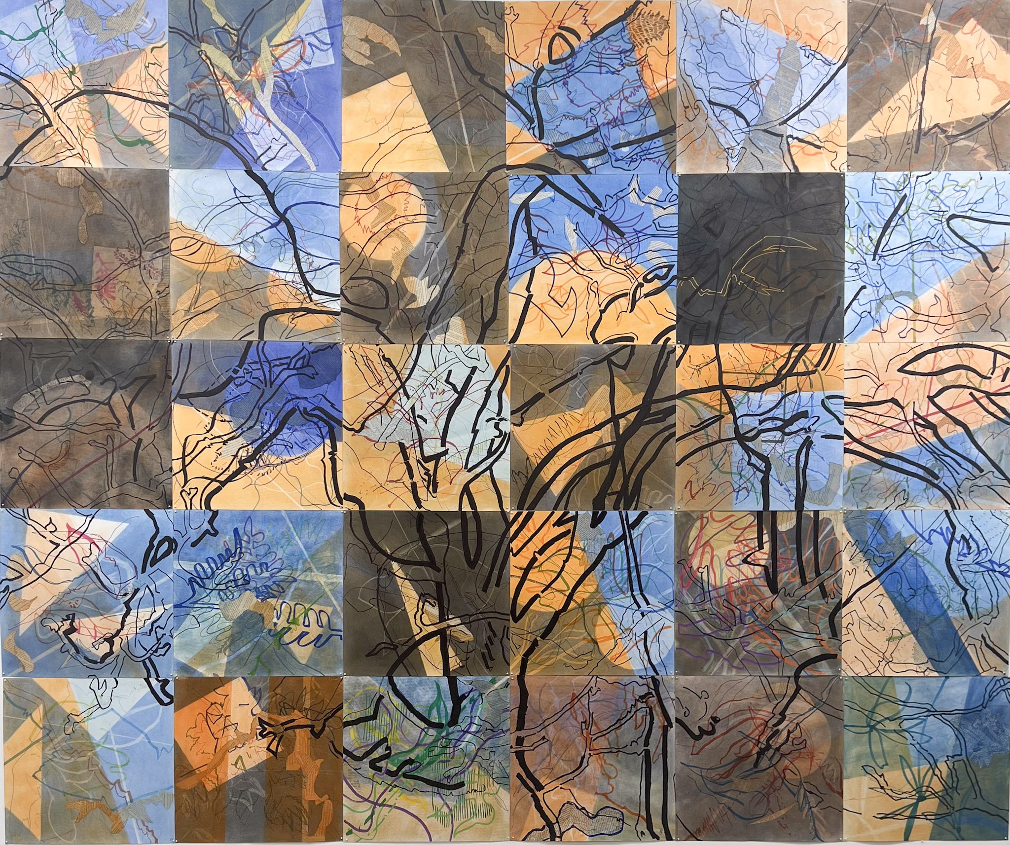
This is the final version of the collaborative work from our DRAW23 exhibition on the wall... it was over 2m square!


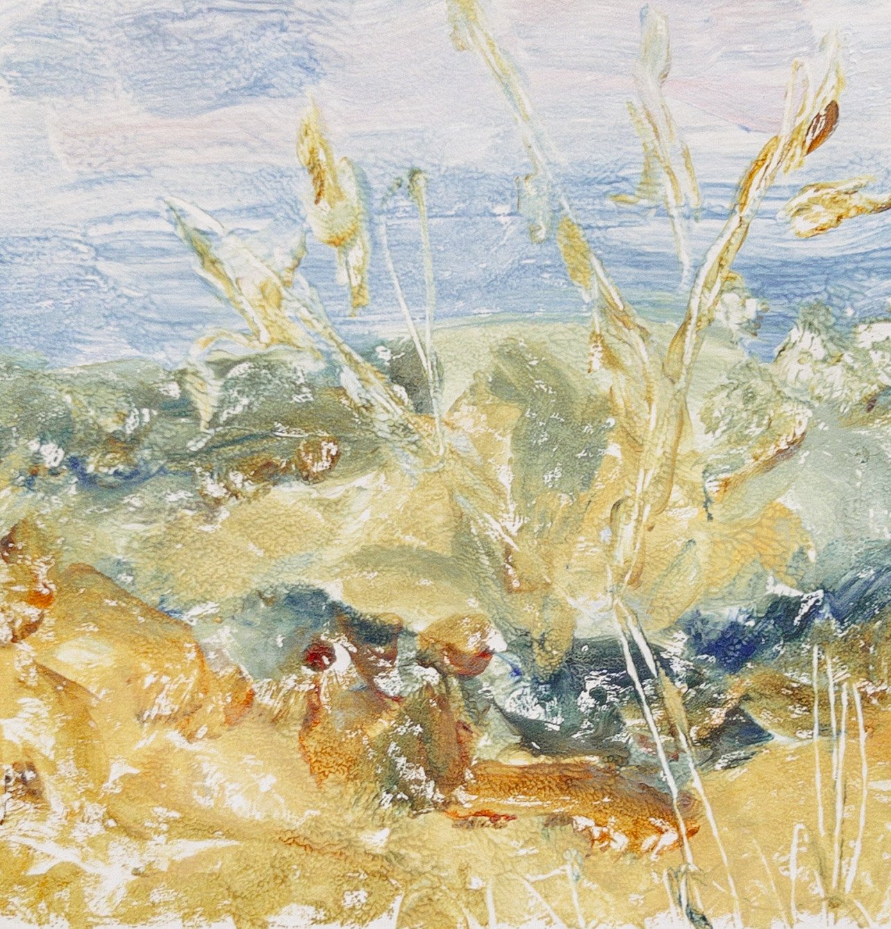
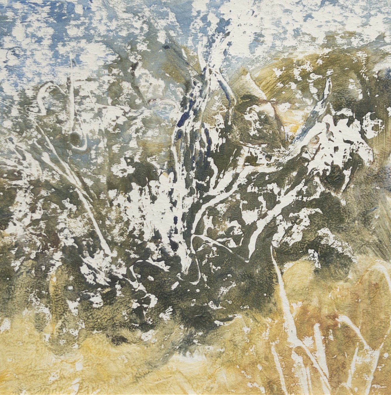
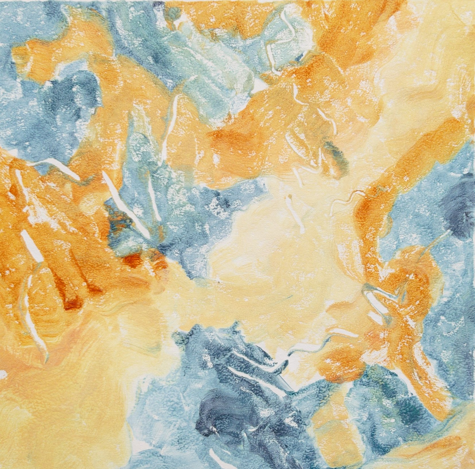
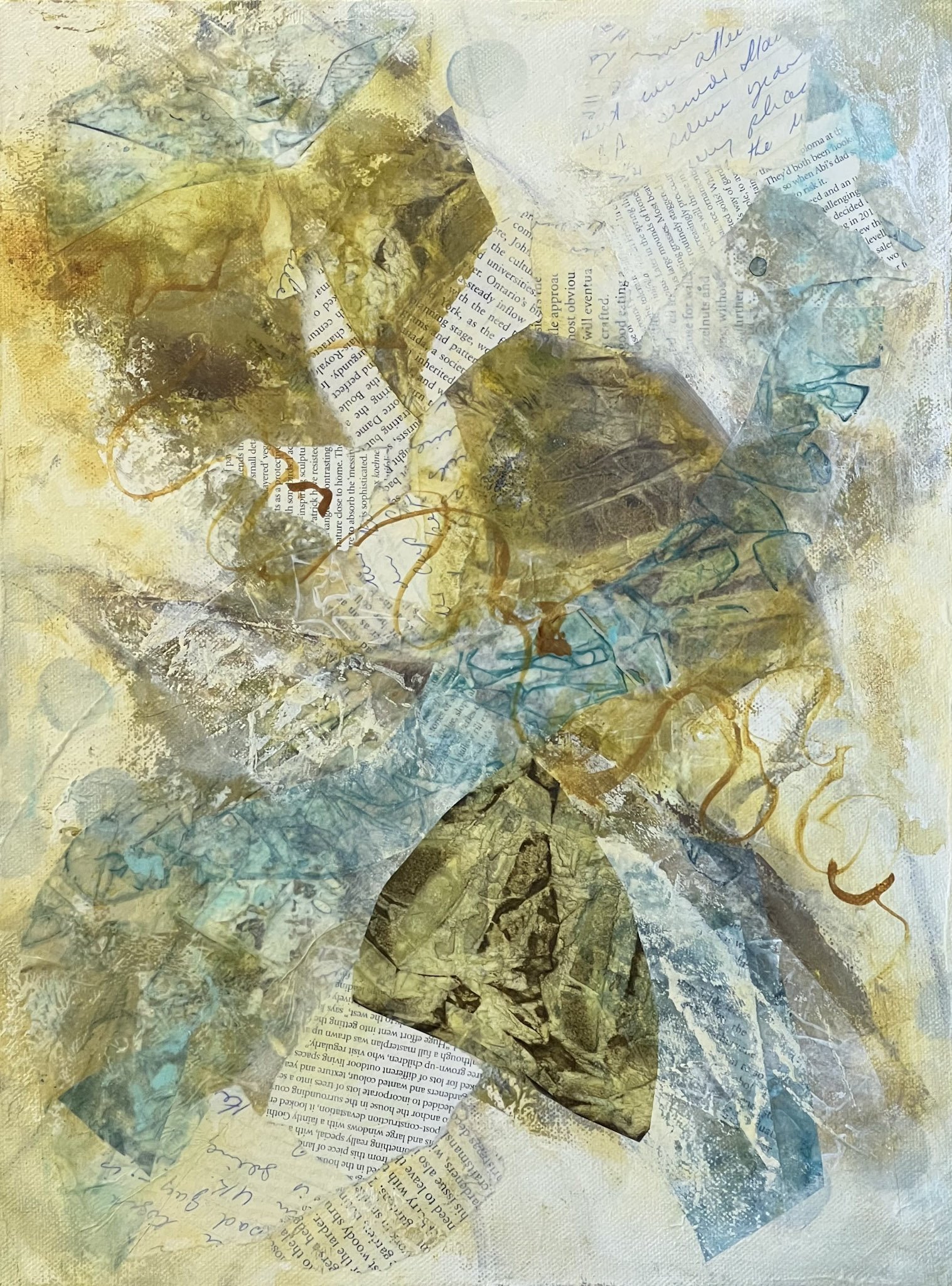
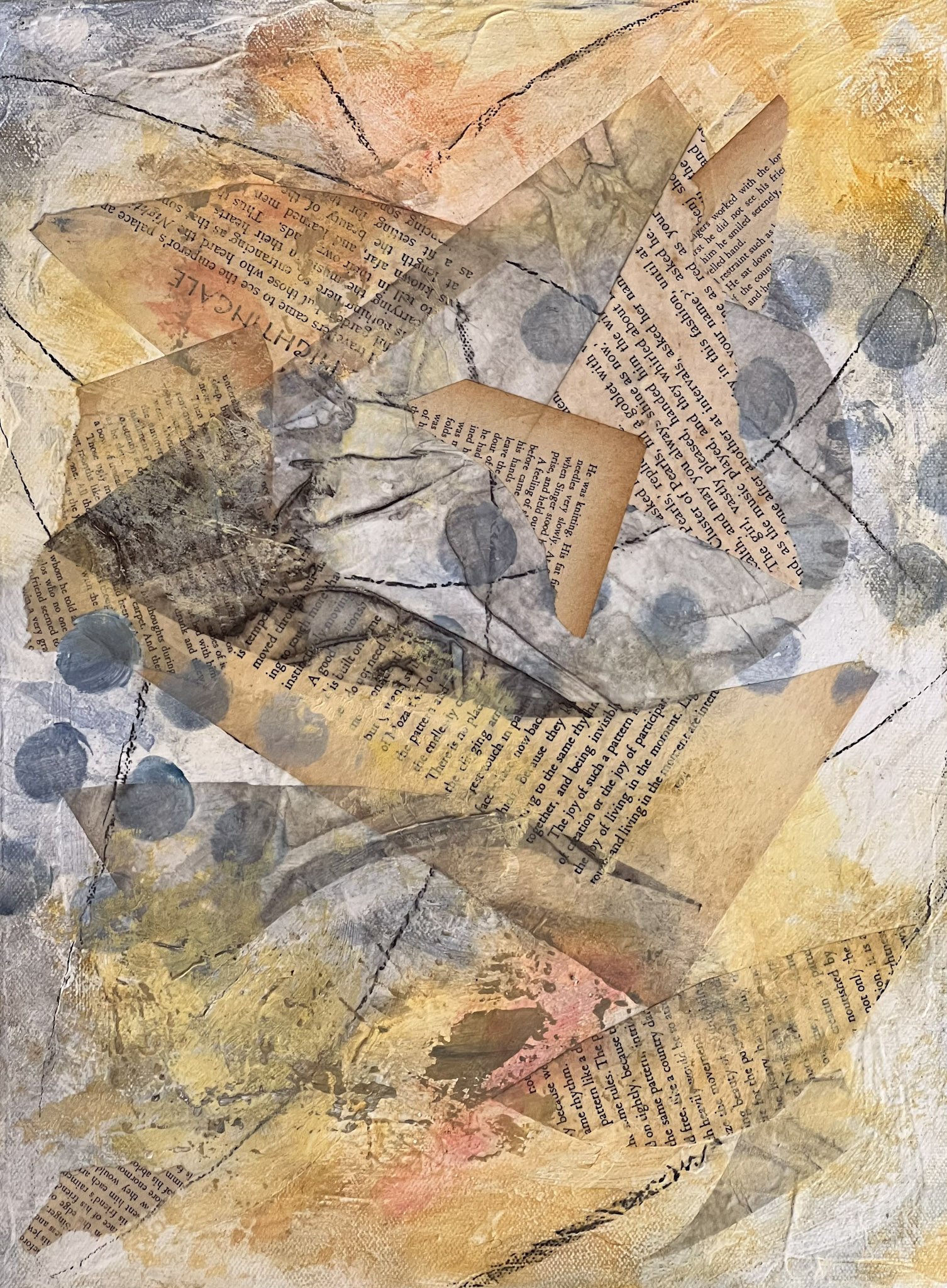
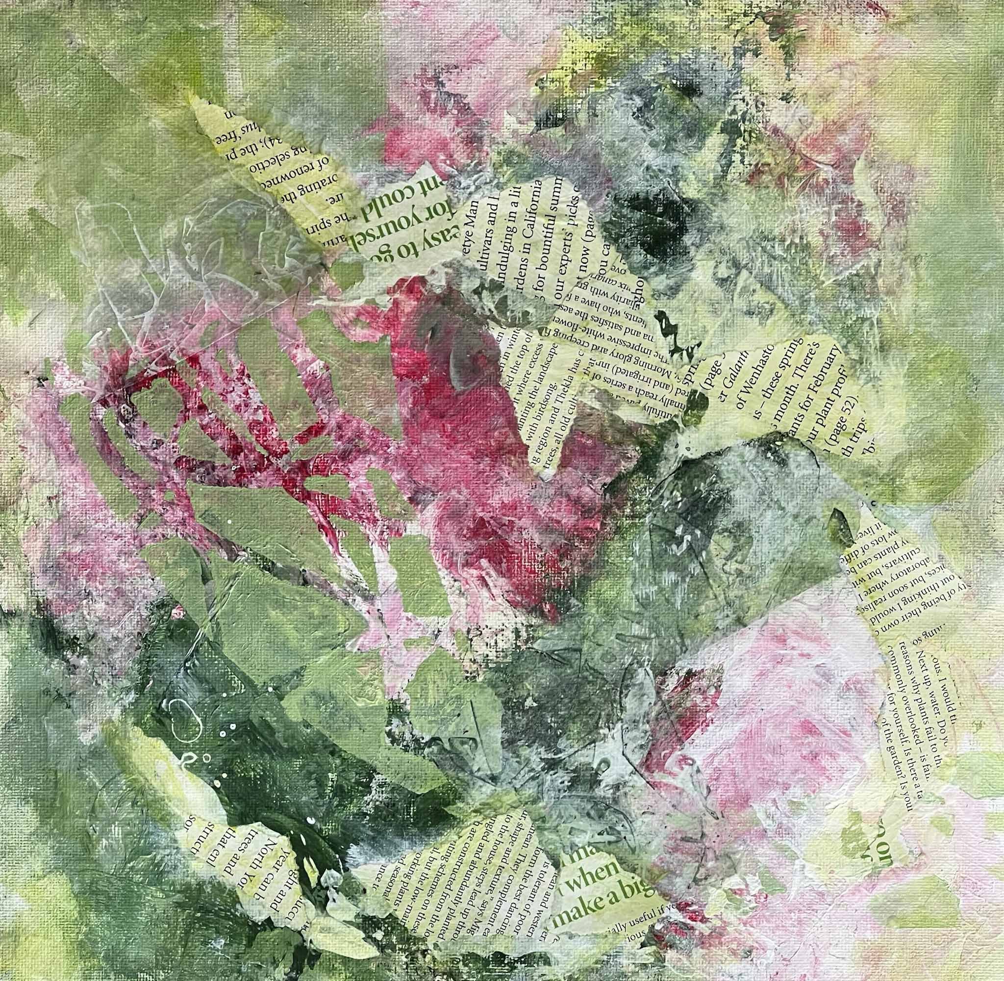
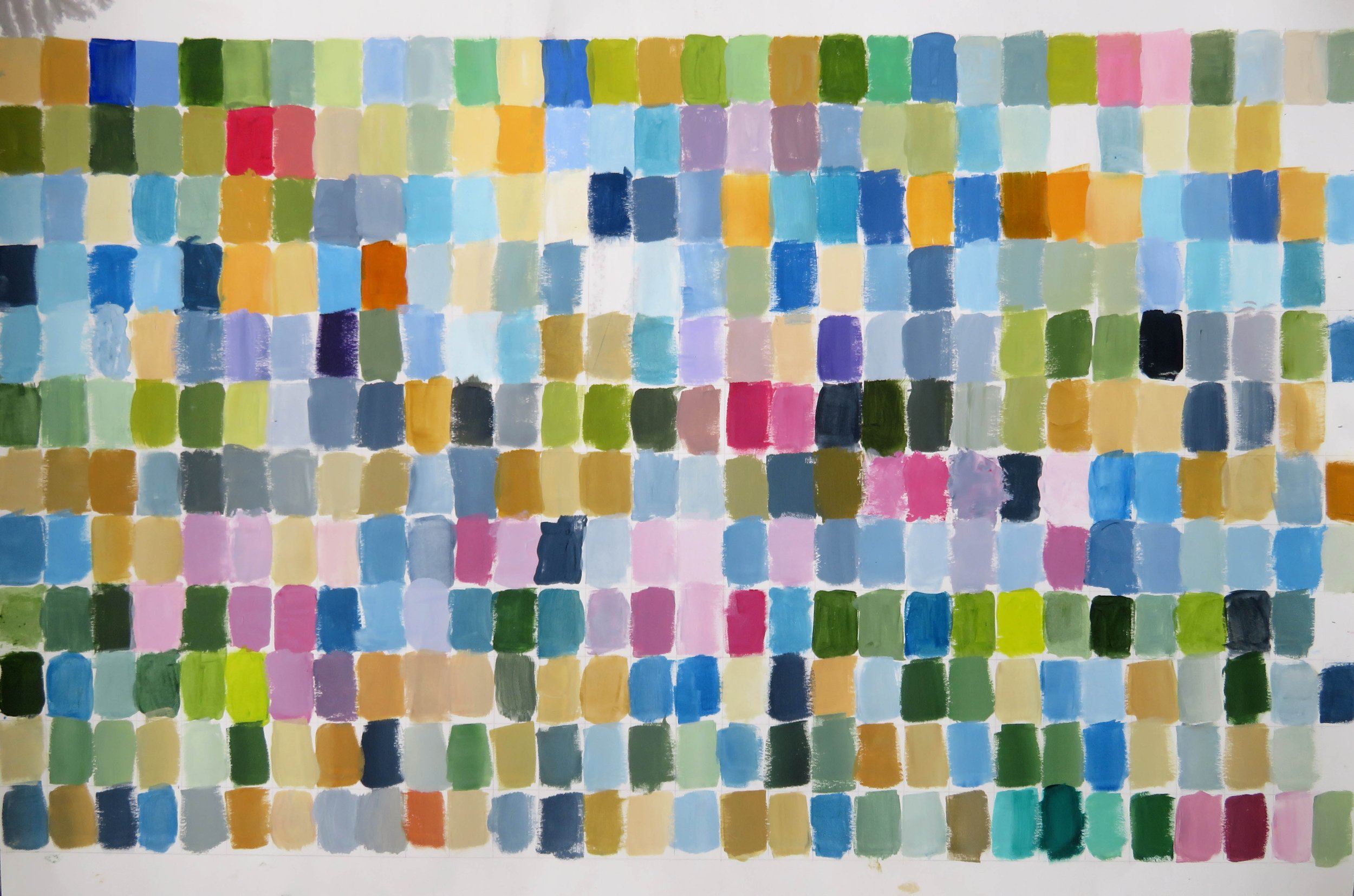
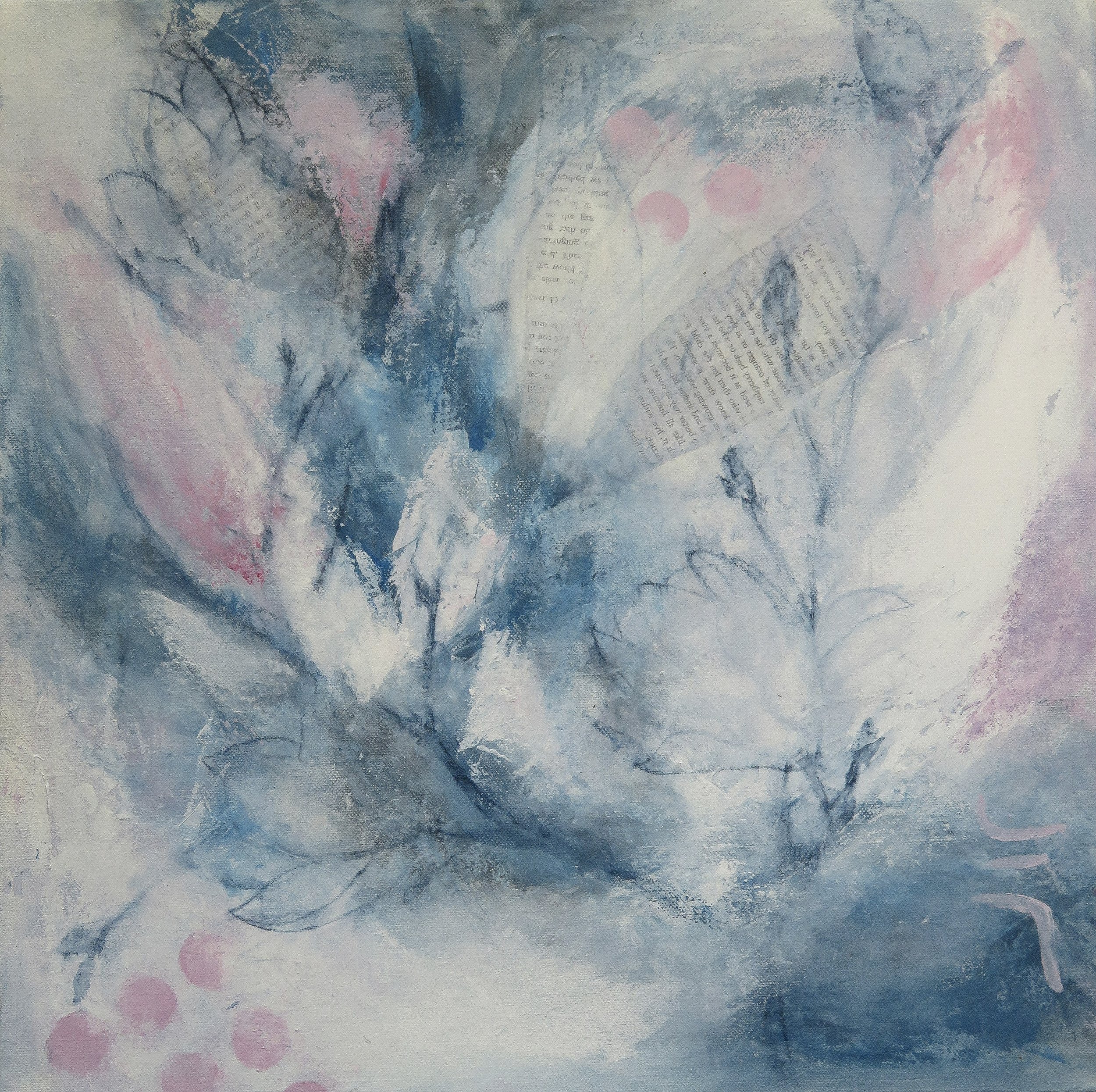
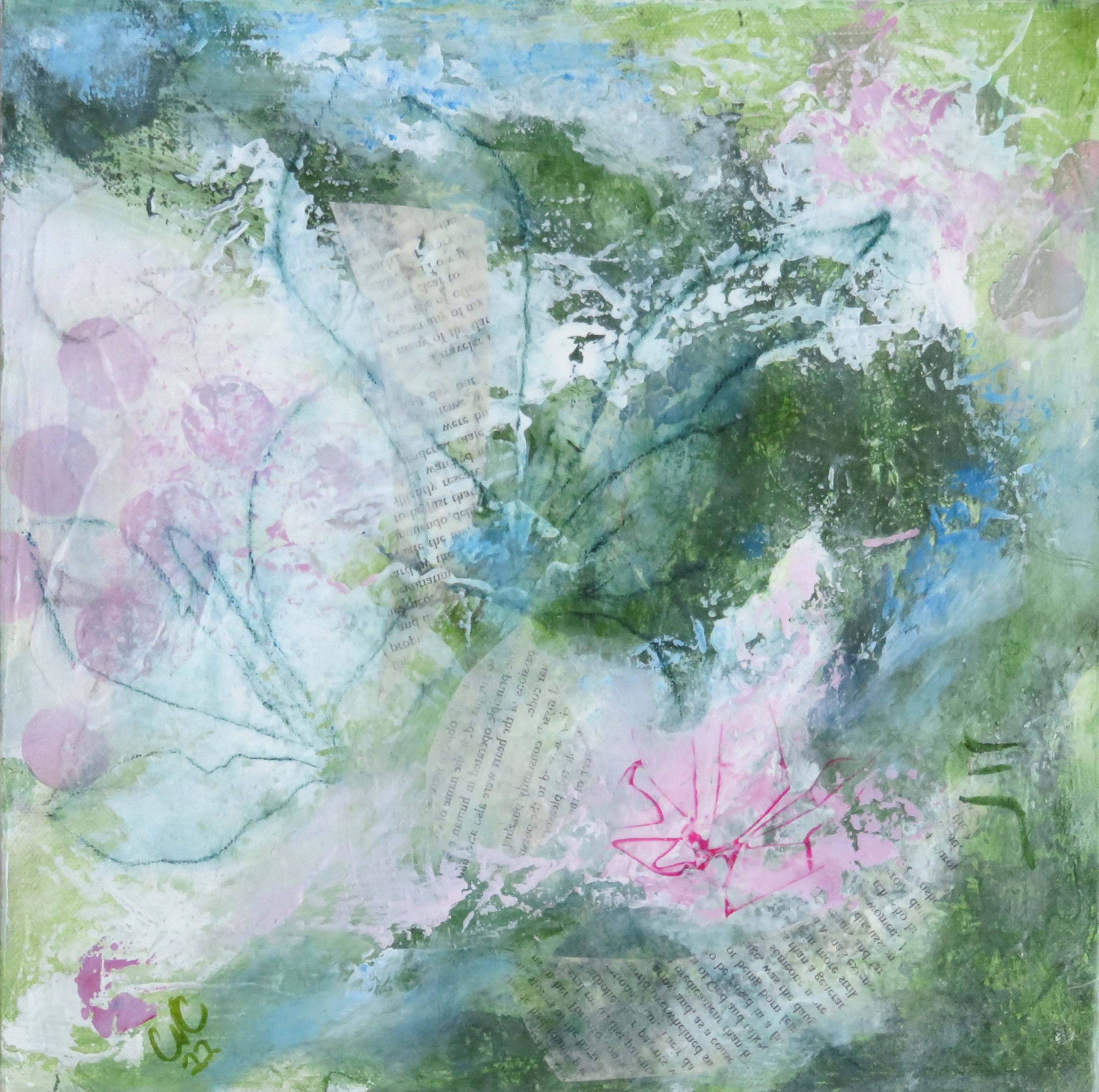
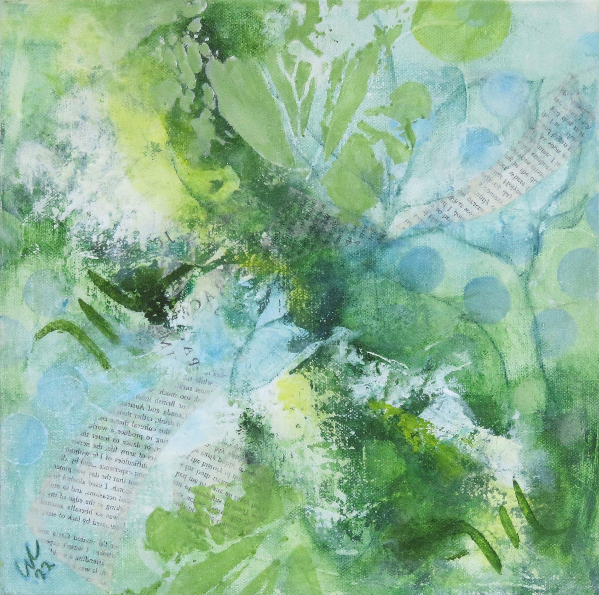
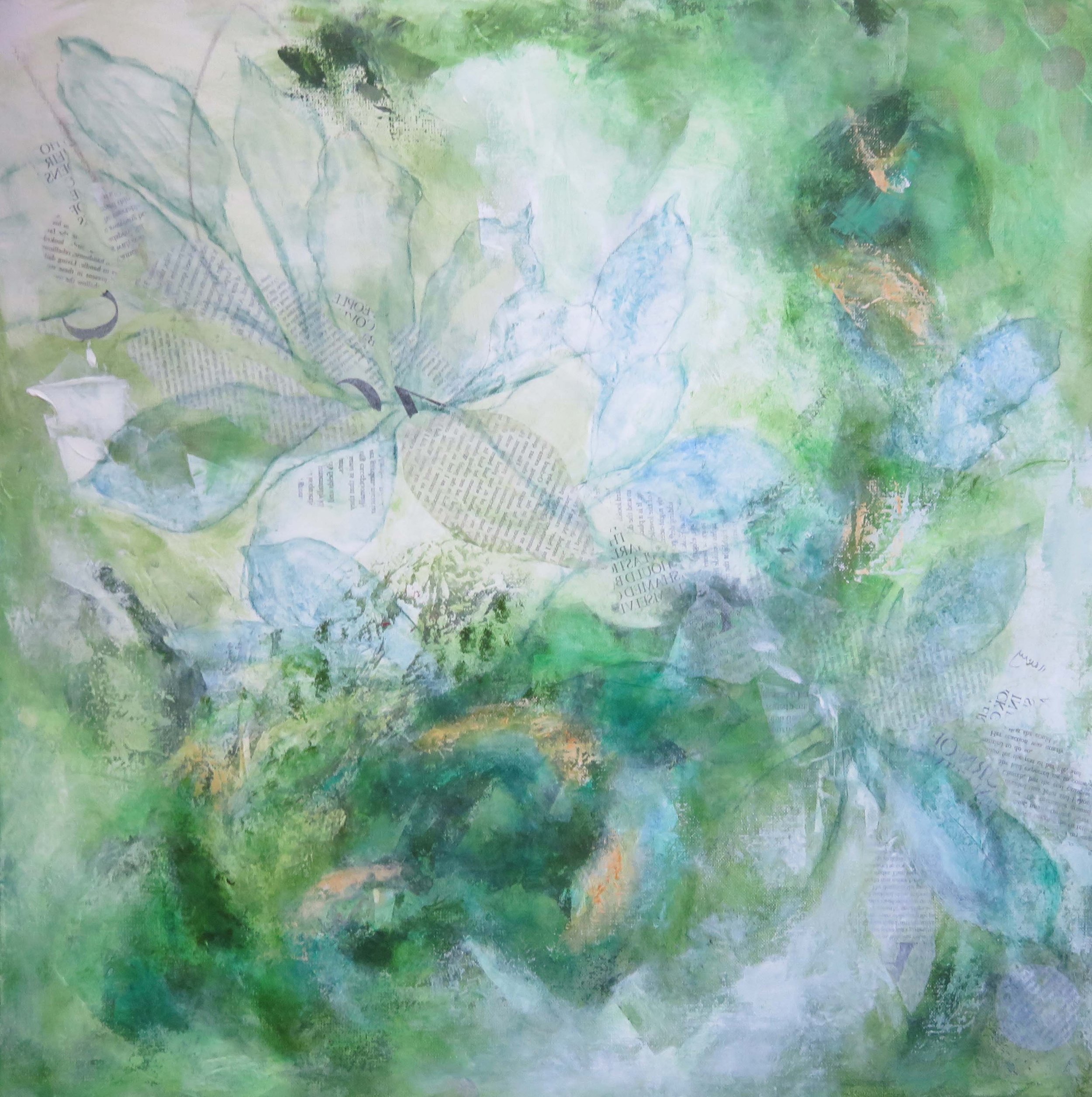
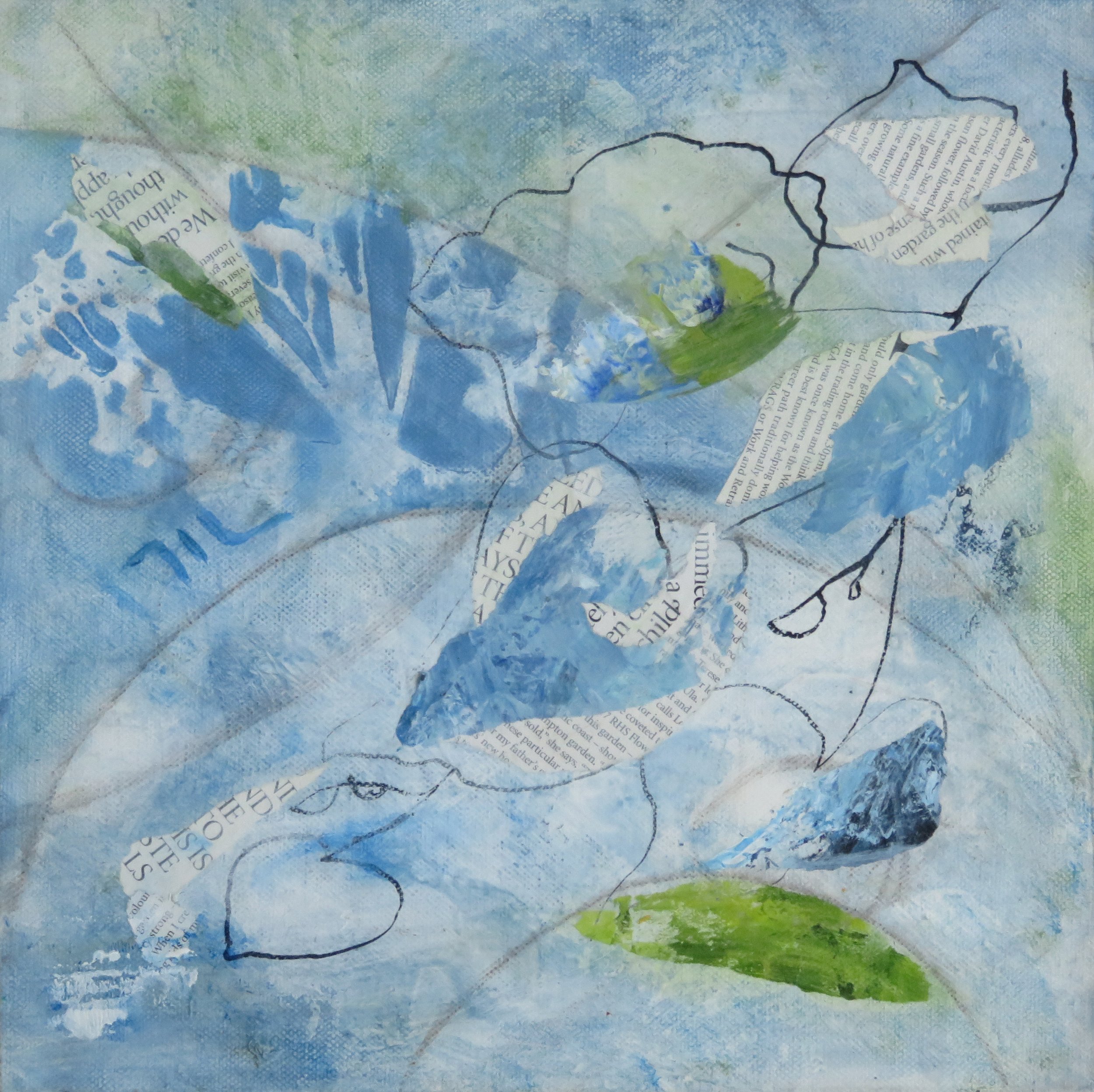
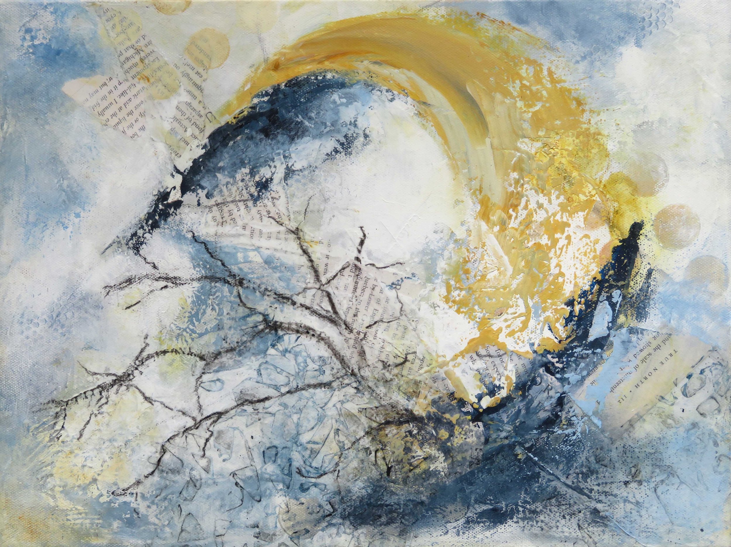
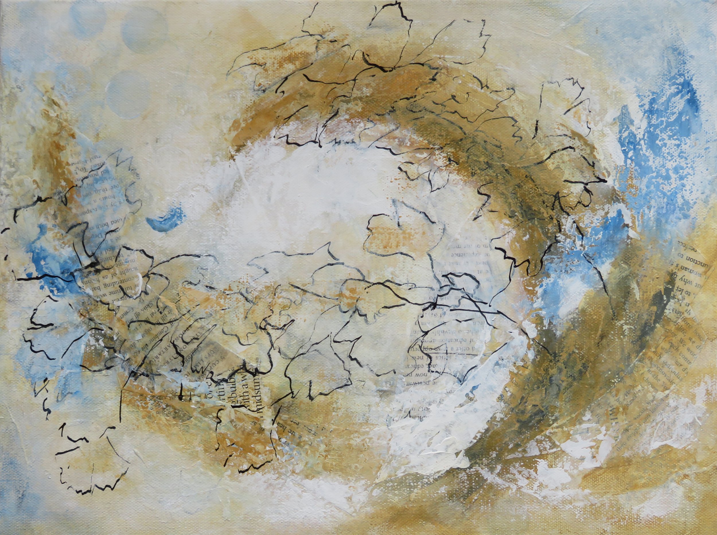
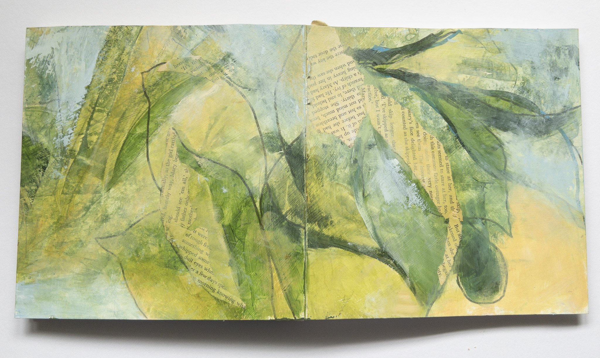
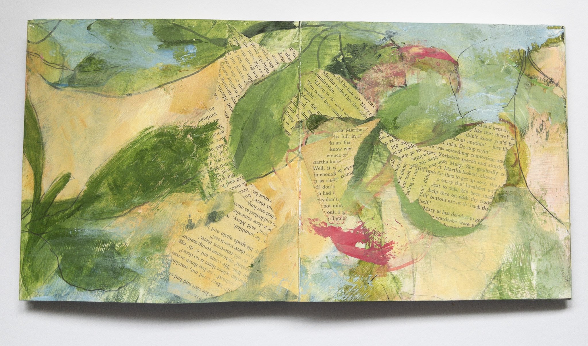
When it came to thinking about a new colour palette and the next evolution of the Songs of The Garden series - I joined 3 strips together for this long book and just kept playing ... lots of fun, no waiting for the paint to dry but not easy to photograph!

For the next one …

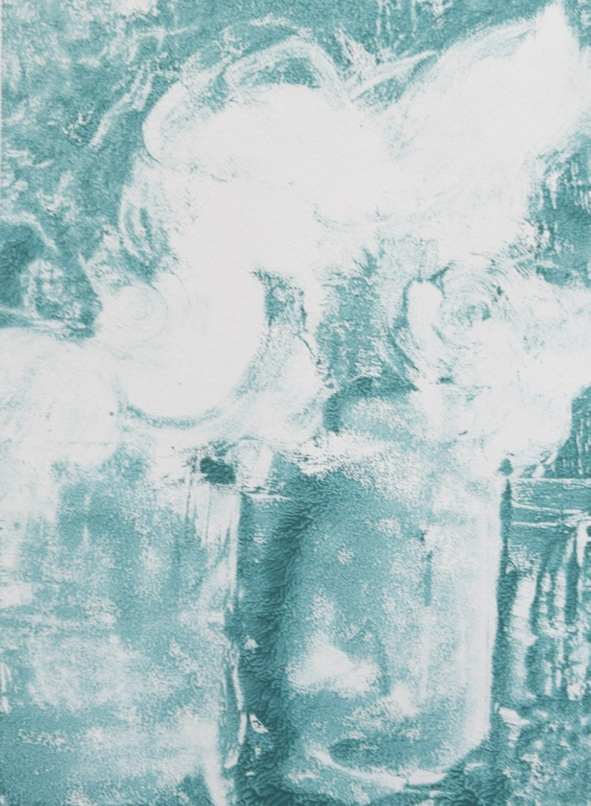
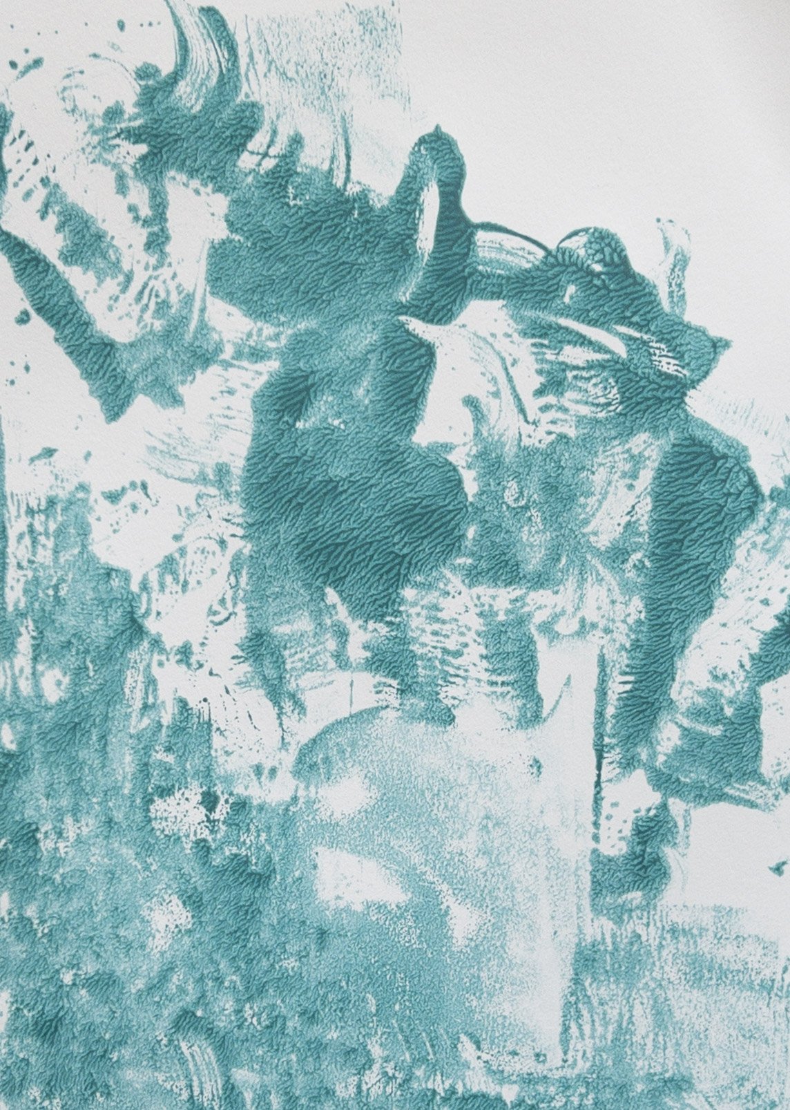
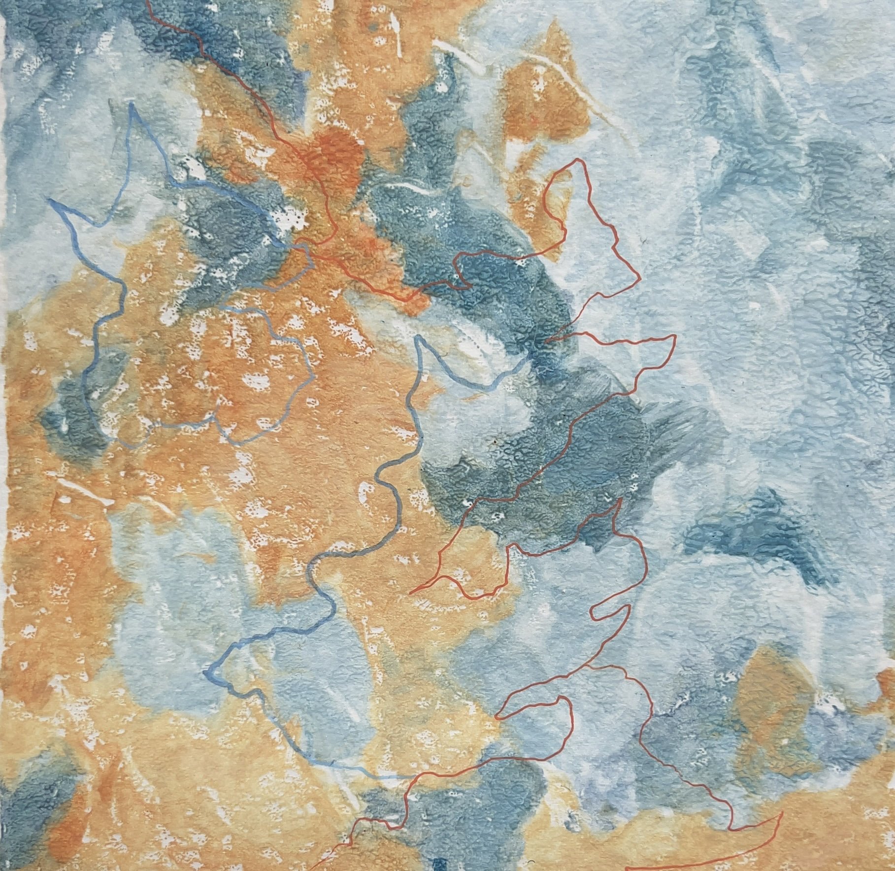
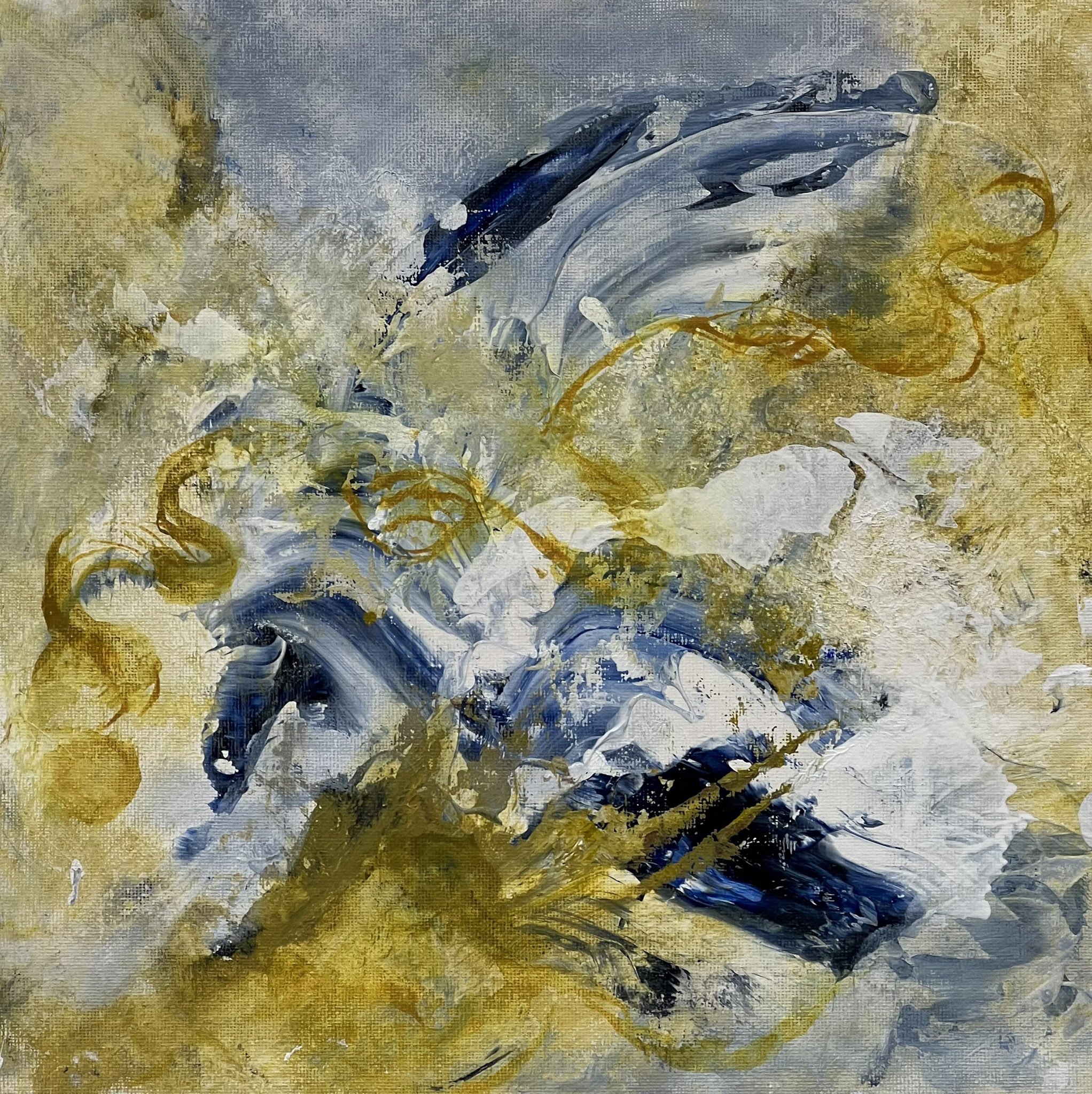
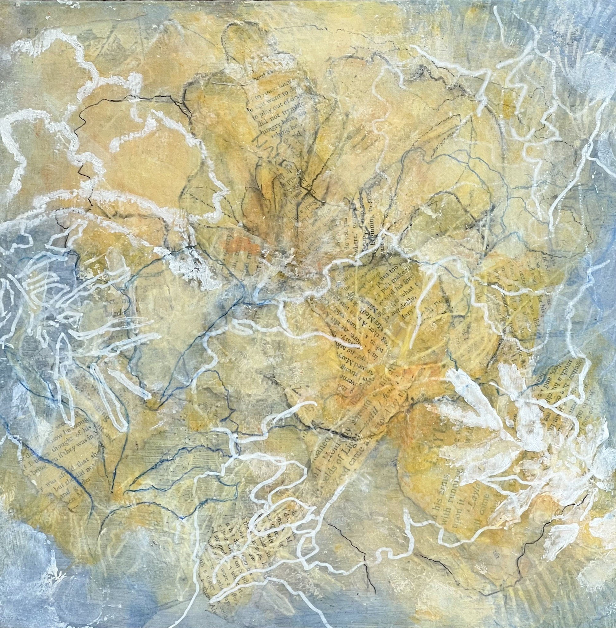
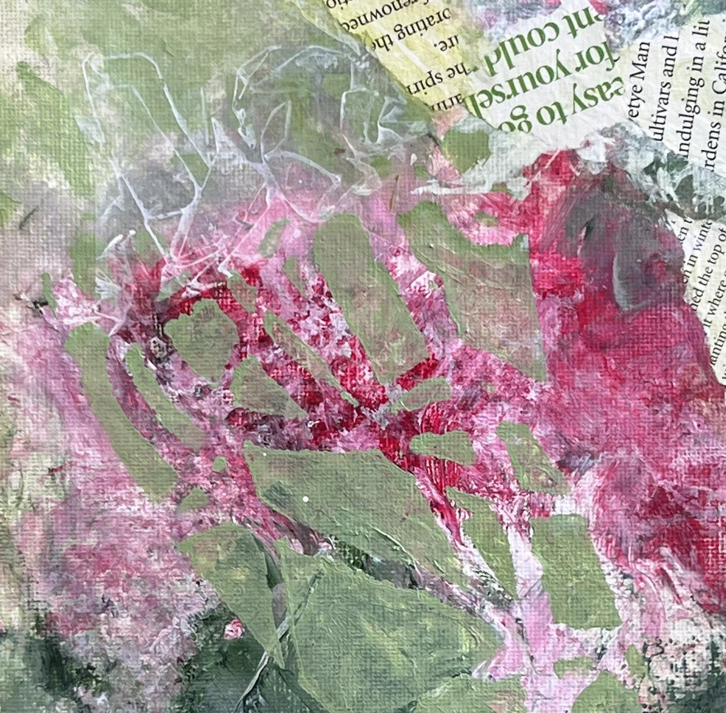
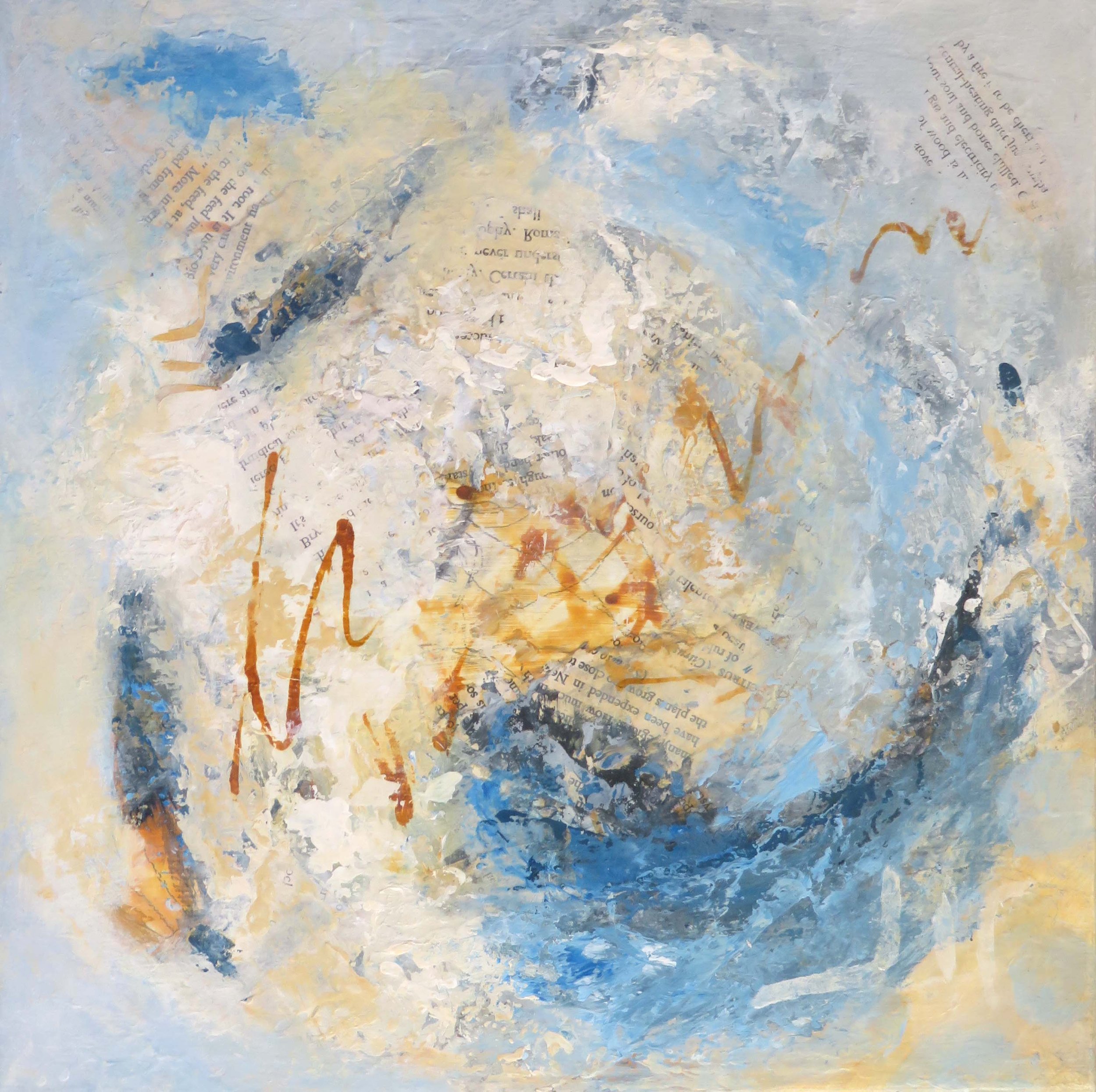
​I decided to try throwing some colour and drawing onto the art paper before making the concertina book and seeing what happens .....

I'll keep you posted!

Thank you for taking the time to read … your interest and support is greatly appreciated!

You are very welcome to forward this email to anyone you think might be interested.

If you have any comments just reply to this email, I love to hear from you ....

Till next time .... CC

Always

Playing with Monoprints

Through the ‘busyness’ of the past month, I have managed some studio time playing with monotypes and monoprints.

For those of you not familiar with this type of work, a monotype is essentially a painting made on any smooth/hard surface that is covered with paper and printed by hand or press to create a singular impression seen in reverse. Monotypes are known for their complete uniqueness!

With a monoprint the image is also created on a plate but the plate can be textured or have elements added to it to create different effects. Monoprints can exhibit a range of variations within a series of prints. The underlying design on the plate will connect the series.

My interest is in the monotype for its expressiveness and surprises … ie somewhat out of my control, which is always a good thing!

These monoprints, using just a turquoise open acrylic were a great exercise and I am thinking I’ll add some more colour with soft pastels …

Any medium can be used to create monotypes but my choice of acrylics brings it’s own challenges. Acrylics are known for their quick drying time, an advantage when creating multiple layers in a painting but an issue for the printing part of the process!

Mediums which keep the paint wet/open are part of the answer but there are also a range of other variables that affect the print … ie the amount and type of medium, thickness of paint, type of paper, brush or other tools used, even weather conditions can play a part! So lots to learn and discover …

These monotypes were created using acrylic open mediums (thick and thin versions) … trying to get the balance right and test out different ways of applying the paint ….

Like drawing, these monoprints and monotypes are great ways to explore a subject or idea as part of the development of new paintings or a new series …. as well as being artworks in their own right.

Look out for more of this style of work going forward ... I think I'm hooked!

Thank you for taking the time to read … your interest and support is greatly appreciated!

Till next time .... CC

Always

PS The drawing class I attend each week is having an exhibition at the Shoalhaven Regional Gallery from 10 -24 November (our almost annual exhibition) ... if you are in the vicinity please drop in and have a look ... lots of amazing drawing and colour this year!

Virtual Gallery in the Making!

One of the things that has been on my wish list for quite some time has been to set up a virtual gallery for my art.

This seemed like it might be a tall order for someone who started out with technology in the days when you had to use punch cards and deliver them to a mainframe computer!

However, over recent months things have started to fall into place:

  • I discovered that ‘Artplacer’ – a platform that I have been using to develop ‘in situ’ images of my artwork, offers a number of virtual galleries and is very user-friendly …

In Situ example

  • The opportunity to be part of a joint textile art exhibition arose and as I was looking at the work for this show I realized what a large body of textile work I had!

So I made the decision to set up a virtual gallery of my textile artworks!

My experience with exhibiting work with galleries to date has been limited largely to providing the work.

The curatorial decisions about the way the work is presented has been in the hands of the Gallery or the group organizing the exhibition.

With this project those curatorial decisions are all mine!

In addition, a virtual gallery is not constrained like a physical gallery – it’s a blank canvas! it is possible to change the colour of the walls, floors and ceilings, the position of work and other elements that might be added, meaning there are a myriad of possibilities!

After playing with the options and getting to know how it all works I realized I needed to be clear about the experience I wanted to create ….

  • what is the exhibition all about – the themes, the inspirations and what ties it all together;

  • in addition to the art work, what other visual elements would support the story I want to tell;

  • how do I want the gallery space to look and feel and

  • how does all this translate into designing the gallery space from a practical perspective.

After much consideration, my aim is to create an immersive experience that will give the viewer a taste of the ‘landscape’ that surrounded and inspired me and helped to create the artwork that is part of the exhibition.

The exhibition is built around the final major work completed in 2019 called ‘Golden Days’ and will include works from the three main textile art series I worked on during the period 2014 to 2019.


The exhibition is falling into place nicely which is very exciting ! … just some of the behind the scenes work to complete.

My plan is to launch the exhibition on my website in early September and

I will let you know as soon as the exhibition is live on my website!

Thank you for taking the time to read … your interest and support is greatly appreciated!

You are very welcome to forward this email to anyone you think might be interested.

If you have any comments just reply to this email, I love to hear from you ....

Till next time .... CC

Freedom to Explore

Hi there

... without the pressure of a new exhibition these past few months, I have taken the opportunity to push my work in a number of different directions, exploring ...

  1. Using collage elements as the feature vs using them as minor elements or background

  2. Making works that are just painted vs making work that is just collage

  3. Using more drawing and/or more pattern in my work

  4. Using glazes and thin paint vs thick paint

This grid shows these variations (in order) ...

I have also been spending some time revisiting that amazing and unending study of colour, exploring more colour mixing, different colour palettes and ways of using them! So much to learn here!

So where did these explorations take me and what do I want to pursue ….

I am very drawn to the work where the collage is featured (especially the text) rather than just an element or background - perhaps a new series?

Areas of thin paint that allow drawn elements/collage to show through so you can see the layering draws me into the work … so more of this!

As I learn more about the practical side of colour I am keen to push my colour boundaries!

Talking about colour, a recent article about the Pierre Bonnard Exhibition, which has just opened at the National Gallery of Victoria caught my attention! Bonnard is know as a master of colour and this exhibition looks amazing!

See a taste of the exhibition in the short video introduction from NGV (2.38mins) Link below .... it's on until October so I'm hoping to find an opportunity to visit!

NGV - Bonnard Exhibition Introduction

Having the space to explore and play is so helpful! It's a way of energising and feeding my art practice and keeping my art moving forward!

I enjoy writing this journal and nearly always find I discover something in the process!

Thank you for taking the time to read … your interest and support is appreciated!

If you have any comments just reply to this email!

Till next time .... CC Always

PS. Thought you might be interested to know about a couple of plans that have recently come together for me ….

I've set up a new profile page on Bluethumb - an Australian online gallery and I'm gradually loading work for sale. I have also given my Website a fresh look and updated images and content. Hope you will check them out when you have a minute and let me know what you think!

Bluethumb Online Gallery

Pattern on Pattern

17 April 2023, Berry

Hi There

Having recently watched the documentary 'Yayoi Kusuma - Infinity' and visited the Art Gallery of NSW to be greeted by a commissioned sculpture 'Flowers that Bloom in the Cosmos 2022' also by Kusama, dots seem to be top of mind ... not really surprising as I am partial to a dot or two!

What is it about pattern, repetition and rhythm in art that we find so satisfying? Perhaps it's a sense of harmony or connection that we feel?

Yet disrupting a pattern or rhythm is a powerful tool to bring us, as viewers, back to the present moment, asking us to look more closely at the use of pattern and repetition. Nature with its scaling, mirroring, rotational elements and imperfections does this most effectively!

A grid of dots, lines of text, the repetition of triangular shapers are all easily discernible patterns that often appear in my work and where I often choose to start!

More irregular patterns such as those in my recent collage papers and the patterns created by natures twinning stems and plants, add layers of complexity.


While some of these elements are symbolic for me, they also add texture and direction as well as harmony and disruption. The variety and combinations of pattern are all part of the story of the piece.

The use of 'pattern on pattern' is incorporated in a set of recent works on canvas paper that are part of my 'Songs from the Garden' series. Here are a couple of examples ...

These have been fun to create and hold the feeling of hope and renewal for me.

In the past couple of weeks I have added a monthly email newsletter 'Art Life Abstract' to my offerings. It focuses on what's happening in the way of new work, exhibitions (mine and others) some special offers (ie free art wall paper for your phone) as well as other interesting art related stuff that sparks my creativity and I hope might inspire you.

You can join the Newsletter HERE or just reply to this email and I'll add you to the list.

These Art Journal posts from the studio with their focus on the art making, process and inspiration will continue in the same format in the middle of each month.

My aim is to build a community of friends, supporters and art lovers not reliant on social media! You can choose what type of content you would like to receive ... either or both?

I am very glad you are part of my art community and greatly appreciate your time, interest and support ....

Till next time ........

Carolyn


Carolyn Collins is a contemporary Australian artist working with a mix of acrylic paint, ink, collage and drawing materials.

Her work is an exploration of resilience through connection to the natural world.

Mapping Colours -Part 2

Back at the start of 2022 I had this bright idea to map my personal colour palette by keeping a chart of the colours I was using in my studio over a 12 month period. Here is a link to that post ….

Mapping Colour 2022

This idea came about after researching colour palettes and an artists reference to her personal colour palette …. which made me wonder what my personal colour palette might look like!

Now I know!

Here is my chart … it survived the chaos of the studio, although a little spilled ink on one corner mars it’s beauty!

While it doesn’t resemble any of the art I made during the year, I can see that these are my colours ….

Muted colours

Blues and greens and lots of variations in between - I’m definitely a cool person, even to the point that my choice of red is on the blue side!

The ochres and siennas that run through the chart along with the Payne’s grey, are earthy colours and provides a grounding for the palette.

There are plenty of light neutrals and tints .

If you look at some the art I made last year you can see that I love to work with …

-limited palettes

-both cool and warm variations of a colour

-increasingly with some strong contrast

-generally lean towards the use of lights and white to make for some luminosity


What can I learn from this and how can I push the boundaries?

I am thinking about extending my use of the colours within this palette, for example exploring different combinations of colours, exploring more tones and tints, more use of complimentary opposites and considering both saturated and muted colour …

I’d also like to see how my palette changes over time - so the plan is to keep mapping through 2023!

Thank you for reading, I appreciate your time.

With very best wishes for 2023 …. CC

Always